The first Henry van de Velde Awards 25 winners have been announced!
Every year, the Henry van de Velde Awards honour products, projects, services and systems by designers and companies from Flanders that, thanks to thoughtful design, have a positive and remarkable impact on our economy, environment and society. A professional jury has now selected the winners of these most prestigious design awards in Belgium within eight different categories.
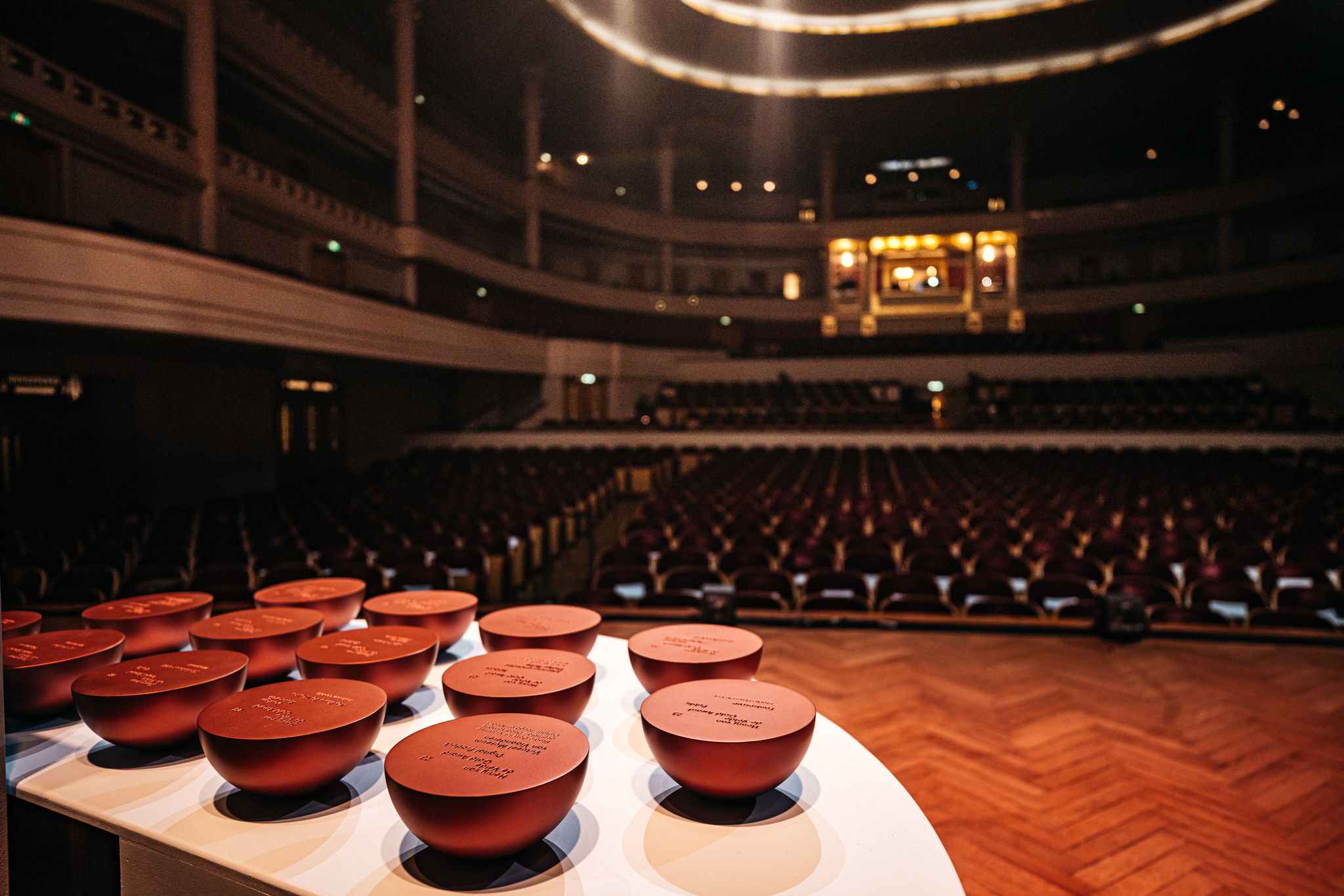
The Henry van de Velde Awards have been presented annually by design and fashion centre Flanders DC since 1994. Today, they have grown into the most important design awards in Belgium and the list of winners constantly offers a sample of design and innovation from Belgium. This year the awards are made possible thanks to the support of the following partners: Flanders Innovation & Entrepreneurship (VLAIO), the Public Waste Agency of Flanders (OVAM), Bokrijk, the National Lottery, Flanders Environment Agency (VMM) and Bozar.
Save the date
The prestigious award ceremony announcing all winners of the Henry van de Velde Awards 25 will take place at Bozar in Brussels on 21 January 2025. That evening the winners of the Gold, Silver and Bronze Award will be announced on stage for each category: Business Innovation, Consumer, Crafts by Bokrijk, Design Research, Environment, Graphics, Habitat and Spaces. In addition, the winners of the Lifetime Achievement, Young Talent, Company, Ecodesign by OVAM and Public Gold Awards will then also be announced.
Everyone will be able to register to attend the ceremony as from 22 November 2024.
Competition: From 14 November 2024 until midnight 19 December 2024, everyone can help decide who may win the Public by National Lottery Gold Award. You can vote for this public award at henryvandevelde.be |
These are the Henry van de Velde Awards winners:
1. Business Innovation
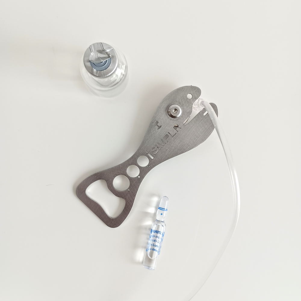
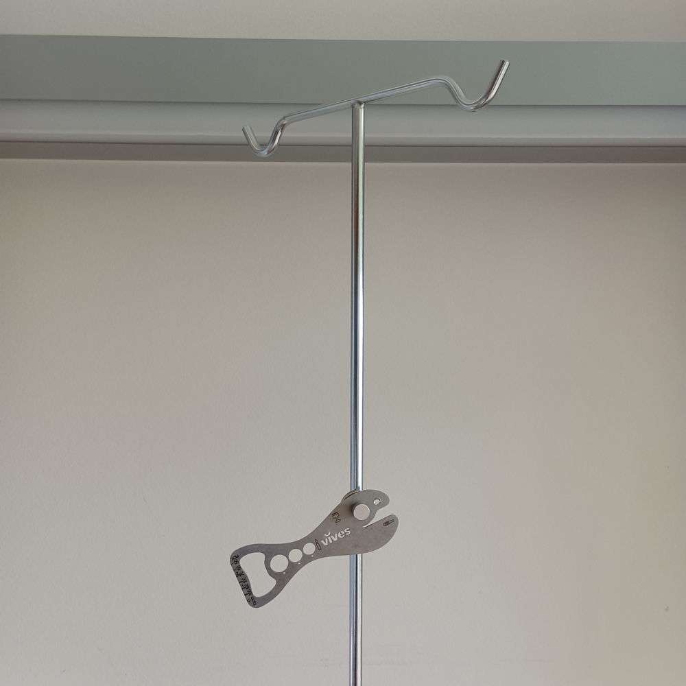
Caretool S!MPLR
Design agency: S!MPLR
Partners: VIVES university of applied sciences and Thomas More hogeschool
S!MPLR is a tool for caregivers that combines several essential tools - such as scissors, ampoule opener, ruler, magnetic key, bottle opener and clamp - in one compact and user-friendly design. The tool is lightweight, durable and hygienic. It increases efficiency, improves safety and minimises the risk of injury. It improves patient care and increases carers' satisfaction.
'In 2018, the idea for S!MPLR arose from a need for a simple, practical tool that healthcare providers can always have at hand. As nurses, we noticed that hands-on care innovation is often skipped, when in fact simple tools are essential at the patient's bedside.' — Dennis Logie and Remko De Duytsche, founders S!MPLR
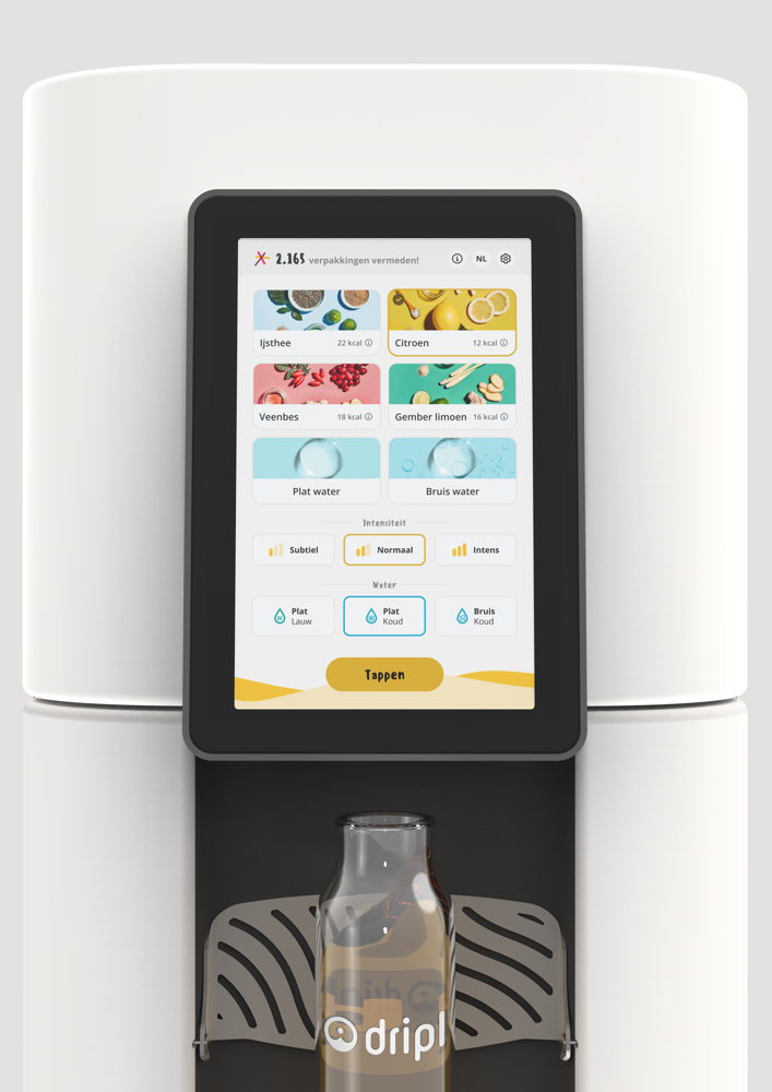
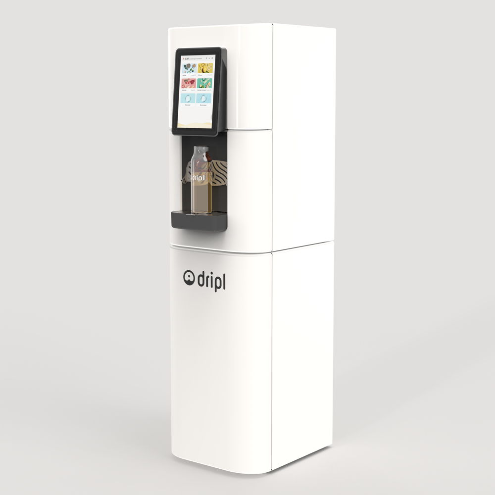
Dripl Refill Point
Design agency: Comate
Client: Dripl
Dripl Refill Point is an office beverage dispenser that allows to fill a drinking bottle or glass with healthy flavours. The device filters and cools tap water, adds effervescence and mixes the water with a flavour concentrate. Drinking soft drinks thus becomes healthier, and also more sustainable as packaging and water transport are avoided.
'The Refill Point allows consumers to drink packaging-free lemonade or flavoured water, without single-use bottles or cans. In this way, we want to avoid the 1.3 billion disposable soft drink containers produced every day. Moreover, we decentralise soft drink production by mixing tap water and flavour on site, instead of pre-filling and transporting. That could save 691 tonnes of CO2 a year in Belgium alone.' — Colin De Blonde, co-founder and CEO Dripl
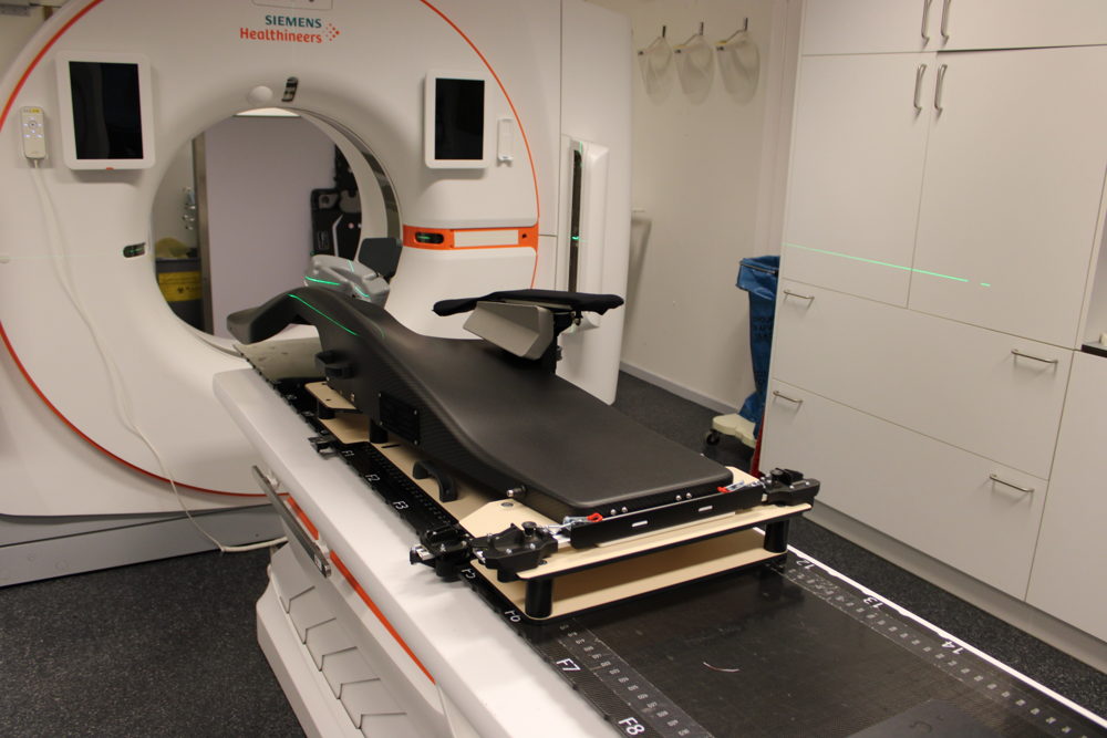
Open Access Breast Couch
Design agency: Max Schoepen and Radion-D
Client: UZ Ghent
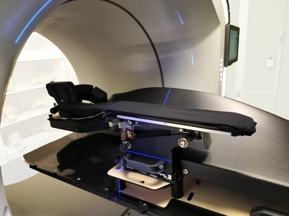
Open Access Breast Couch is a positioning platform for chest radiotherapy. If the patient lies on their stomach, radiation can be delivered more precisely, avoiding potentially harmful, even fatal, side effects of the therapy. The device is currently used in three Belgian hospitals and already served hundreds of patients. The design was scientifically based through clinical studies and combines medical science with engineering and ergonomics.
'This device can spare patients harmful short- and long-term side effects. These can range from damaged skin to cardiac arrhythmias.' — Max Schoepen, designer Radion-D
2. Consumer
Fairbuds
Design agency: Dott Achilles
Client: Fairphone
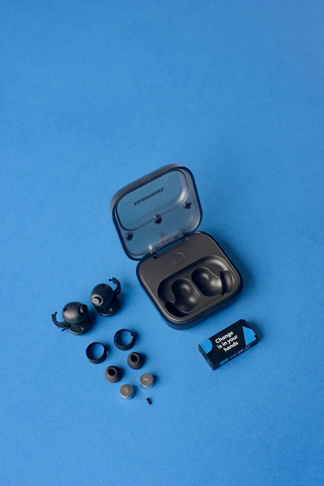
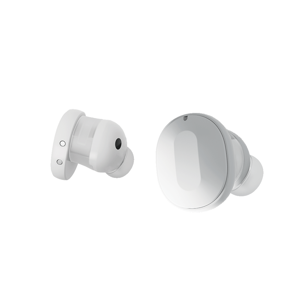
Fairbuds are wireless earbuds with active noise-cancelling that are kept in an accompanying case with charging function. They are made of materials that are recyclable and fair. Both the case and the earbuds are designed to be easily repairable, and the batteries are easy to replace.
'Most earplugs are completely glued shut. This makes them compact, but as soon as something breaks, they have to go in the bin. With Fairbuds, users can easily replace various parts, such as the battery, themselves. This makes the product last longer.' — Bert Jacobs, designer Dott Achilles
Urbanisto
Design agency: Dott Achilles
Client: Urbanisto
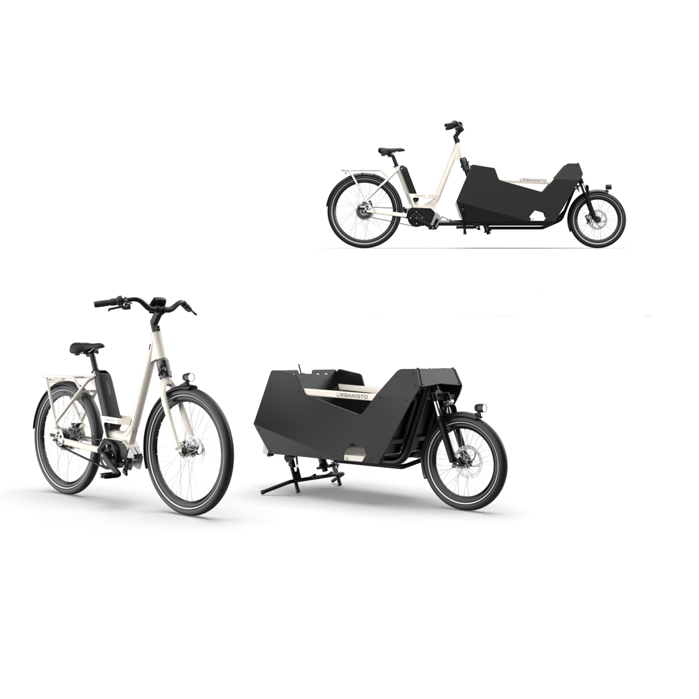
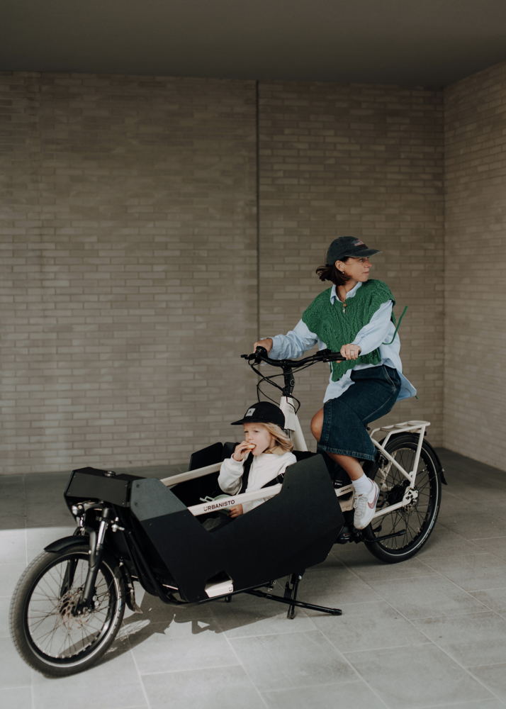
Urbanisto is a modular bike solution where you can easily switch between a regular electric bike, a family cargo bike or a practical cargo bike. The bike responds to the changing needs of cyclists. As a consumer, you only need to invest in one electric driving system, which significantly reduces maintenance and repair costs. With easily connectable front-end modules, you can create various mobility solutions in no time.
'Launching a new bicycle brand with a new product from scratch as a start-up in Flanders is no easy task. Especially realising a product that can be produced at a competitive price and also looks good is a huge challenge.' — Benjamin Declercq, founder Urbanisto and Simon Depauw, senior industrial designer Dott Achilles
Verde KinetiCore
Design agency: Lazer Sport
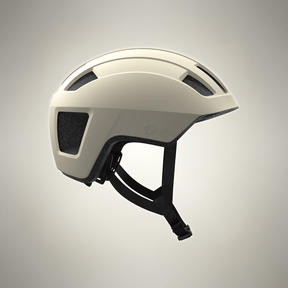
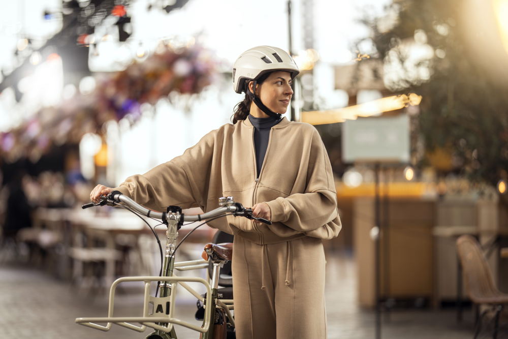
Verde KinetiCore is a bicycle helmet where the use of materials is minimised by reducing the number of components used. The components indispensable for the production of the helmet are made of 70% recycled material. Moreover, the entire helmet is recyclable. Because no glue was used, the helmet can be easily disassembled and recycled at the end of its life cycle.
'There was a growing realisation from the Lazer design team that our products have a significant impact on the environment. This is often diametrically opposed to the motivations of cyclists, who by taking the bike just want to reduce their carbon footprint.' — Design team Lazer Sport
3. Crafts by Bokrijk
Al Khat
Designers: Gillis & Aniss
Client: Flanders DC (FOR THE NOW)
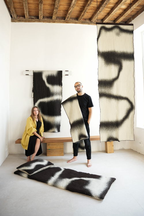
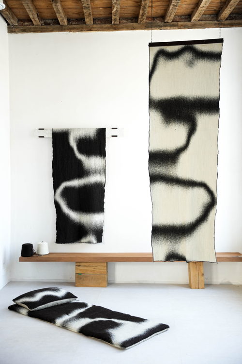
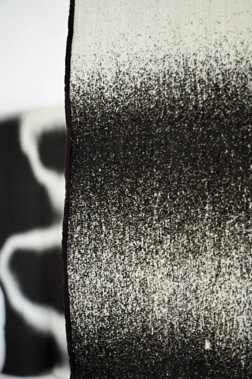
Al Khat is a multifunctional textile inspired by the haïk, a traditional Moroccan garment and interior object. It refers to the history of the two designers, Flemish and Moroccan. After thorough research, the Belgian wool was spun in a small artisanal spinning mill and woven on industrial Flemish jaquard looms. Al Khat thus forms the bridge between craft and industry. The drawing in the textile forms a deconstruction of a barcode, referring to overconsumption.
'Currently, local wool largely ends up in the incinerator due to cheap competition from abroad. The once flourishing wool processing industry in Belgium has almost disappeared. We want to revalue that valuable material, stop the burning of this durable fibre and reconnect people with locally made objects.' — An Gillis and Nabil Aniss, designer and artist
Guided by Tiles
Design agency: Dear Reader, (Eva Moulaert with Robin Vermeersch)
Client: Ouest Architecture
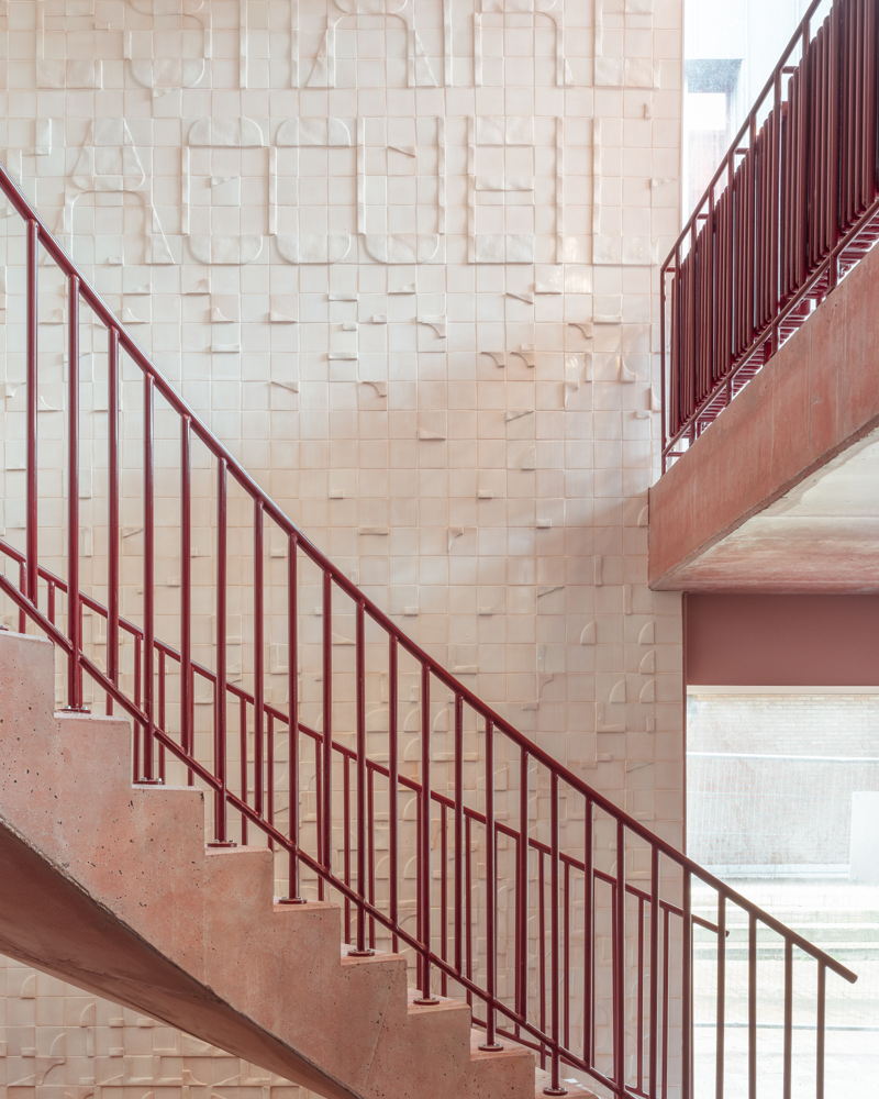
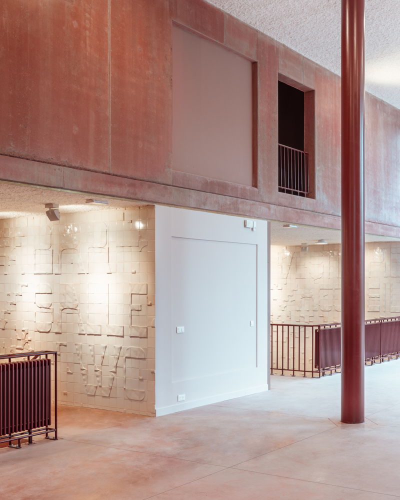
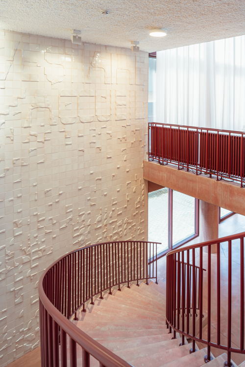
Guided by Tiles is a tile design consisting of a set of 24 tile shapes used to form both arrows and words (signalling) and drawings (art integration). The tile design was designed for the renovation of theatre Le Vilar in Louvain-la-Neuve. The signage transcends the purely functional and focuses on the active experience of the space.
'Both signage and art integration are usually considered in construction projects in semi-public space at the final stage of the design process. Consequently, they often form an isolated layer that is literally and figuratively detached from the architectural concept and adds little to it. With this project, we want to initiate reflection on shifts in common partnerships in a design process, and on the effect such shifts can have on the final result.' — Eva Moulaert, graphic designer Dear Reader
IT Pieces
Designer: Flora Miranda
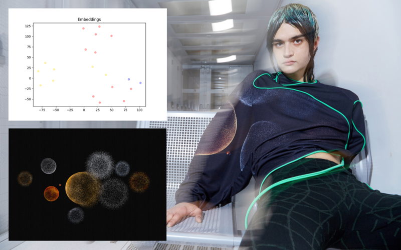
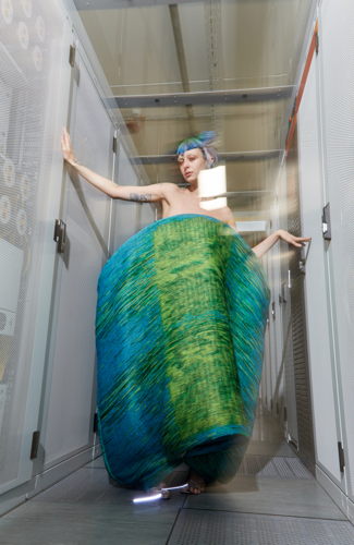
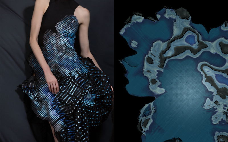
IT Pieces explores how abstract data and generative systems can be transformed into textiles. Combining digital innovation with traditional craft creates unique creations such as dresses, coats and scarves. Machine learning, 3D printing, laser cutting and traditional methods such as weaving and embroidery are used to create designs that tell stories. This research focuses on how technology can transform fashion.
'It all started with my master collection at the Antwerp fashion academy in 2014. I took my inspiration from quantum physics and it changed my view of the world: everything is made of the smallest building blocks. That's how my interest in data was born. Since then, I explore this abstract matter and connect it to the sensual world of art, fashion and music where I originally come from.' — Flora Miranda, creative
4. Design Research
Ghent Waste Brick for DING
Design agency: BC materials
Client: Design Museum Gent and sogent
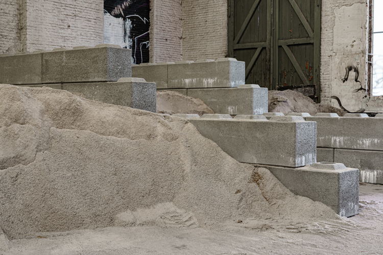
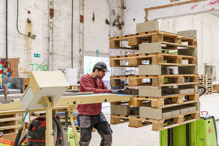
Gent Waste Brick for DING is a circular facing brick that will be used for the new museum wing of Design Museum Ghent. The brick is made of lime, sand, white cement and 63% raw materials derived from waste streams from Ghent, namely crushed concrete and crushed construction glass. It is a unique white facing brick with a special texture, a ‘clean’ production that does not involve an oven. After extensive research, the design team opted for pressed rather than fired bricks because of their lowerCO2 impact. In production, the raw materials are mixed, after which the bricks are pressed, cured and dried.
'Making a facing brick from local waste seemed like a distant dream in 2020, when the research started. A pressed façade brick was not available then. By effectively manufacturing and using the facing brick, we show that there is a future for locally pressed building material, made from locally available waste residues and produced locally. We hope it will inspire other companies.' — BC materials, Design Museum Ghent and sogent
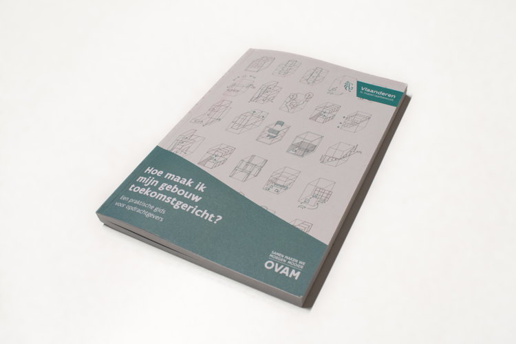
How do I make my building future-proof?
Design agency: archipelago architects
Client: OVAM
Partner: CERAA
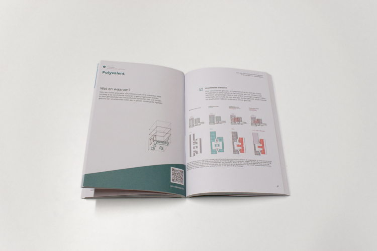
How do I make my building future-proof? is a practical guide for clients to start a future-oriented (re)construction project that responds to societal changes and leads to more efficient use of resources and energy. The guide starts from questions about the current and future needs of a building's users and offers a checklist of ambitions to align with the project and an overview of existing studies and tools that can help in the next stages of the project. The guide exists in a printed version and is also available online.
'We aim to provide low-threshold insights into future-oriented (re)construction with this publication. The publication is tailored to clients, as they are the decisive factor and determine the sustainability ambitions of a project. With this hands-on interactive publication, we challenge readers to think critically about their project and raise the bar ever higher.' — Maarten Lambrechts, architect and director archipelago
Phonobet
Designer: Walda Verbaenen
Partners: MAD-Research, PXL-MAD School of Arts / UHasselt (research group READSEARCH)
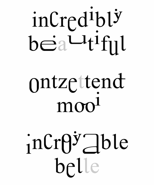
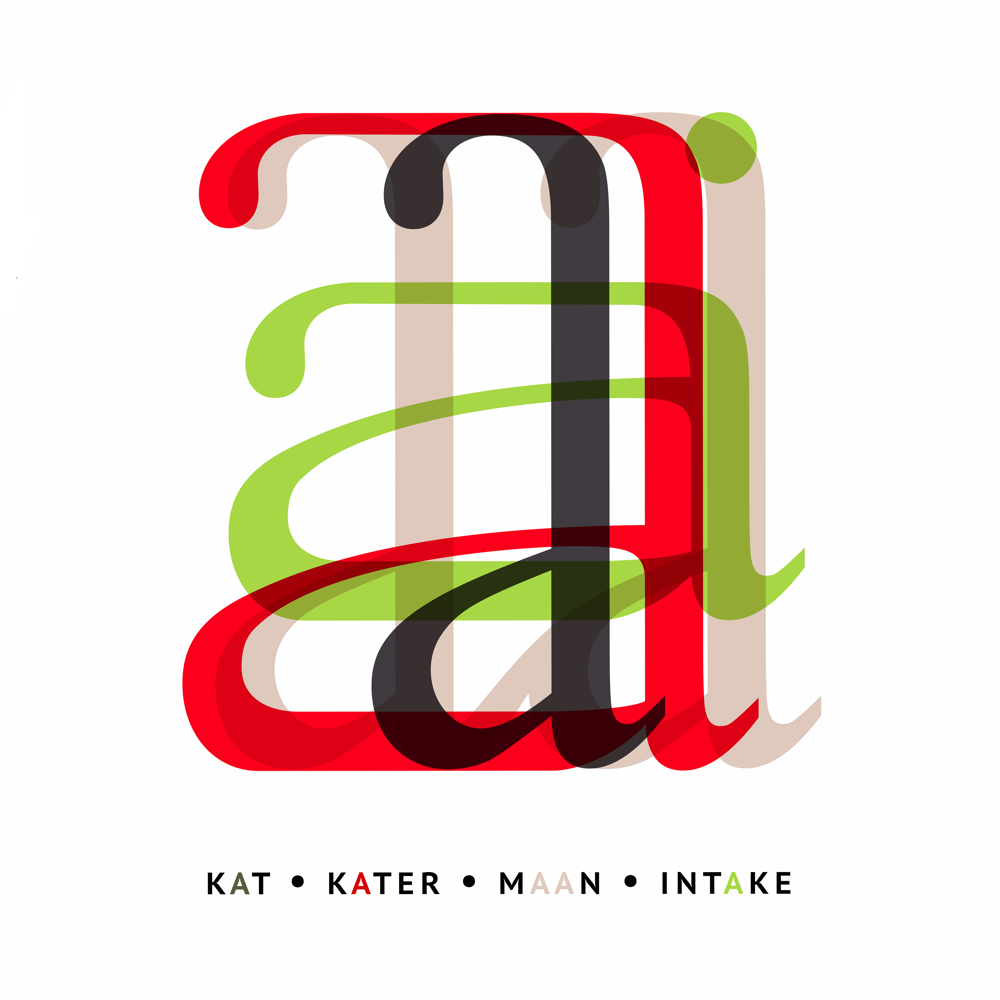
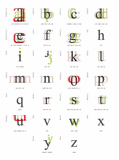
Phonobet is an alphabet with recognisable letter shapes that provides assistance in the correct pronunciation of an unfamiliar language for the non-native reader. Depending on the mouth opening when pronouncing a sound, letter shapes were adjusted in height or made larger. Letter shapes visualising long pronounced sounds were also made wider. Letters pronounced together were linked together. The supporting function and power that design and typography can provide build a bridge to bring people closer together.
'Phonobet investigates the extent to which the gap between pronunciation and written image can be reduced. To this end, the letters of the Latin script were used with small but systematic modifications that point the way to correct pronunciation without affecting correct spelling. It forms a guidebook, so to speak, with small visual hints as you read.' — Walda Verbaenen, graphic designer
5. Environment
Ghent Waste Brick for DING
Design agency: BC materials
Client: Design Museum Ghent and sogent
This project also won within the category Design Research.
FenNet
Design agency: Pars Pro Toto
Client: Hommes et Terre
Partners: Fentum
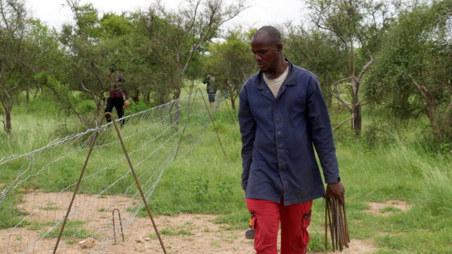
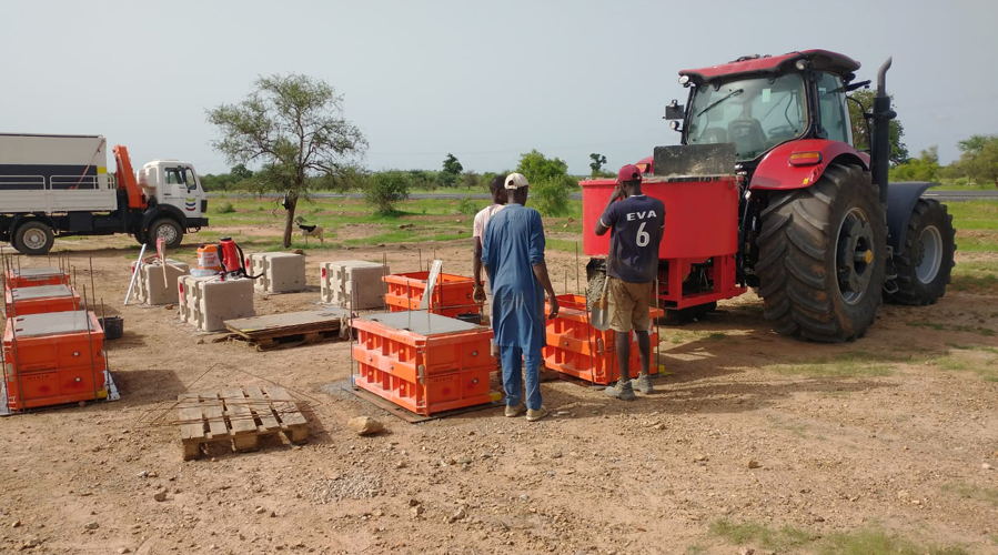
FenNet is a reusable and movable fence to enable successful landscape restoration through reforestation in the pastoral regions of western Africa. The fence, produced entirely locally and inexpensively, protects freshly planted and sown sites from goats and sheep for the first few years. This allows young trees to reach full strength, and the ecosystem to recover on its own. In a second phase, FenNet allows rotational grazing by dividing the site into enclosed zones. In this way, FenNet is an important tool in the permanent fight against desertification.
'Because of its simplicity, FenNet is easy and cheap to produce on a large scale. But the impact on the site is significant. Reforestation is much less likely to succeed if the site is not protected from grazers.' — Kristoff Leue, CEO Hommes et Terre
Jaga Net Zero
Design agency: Jaga
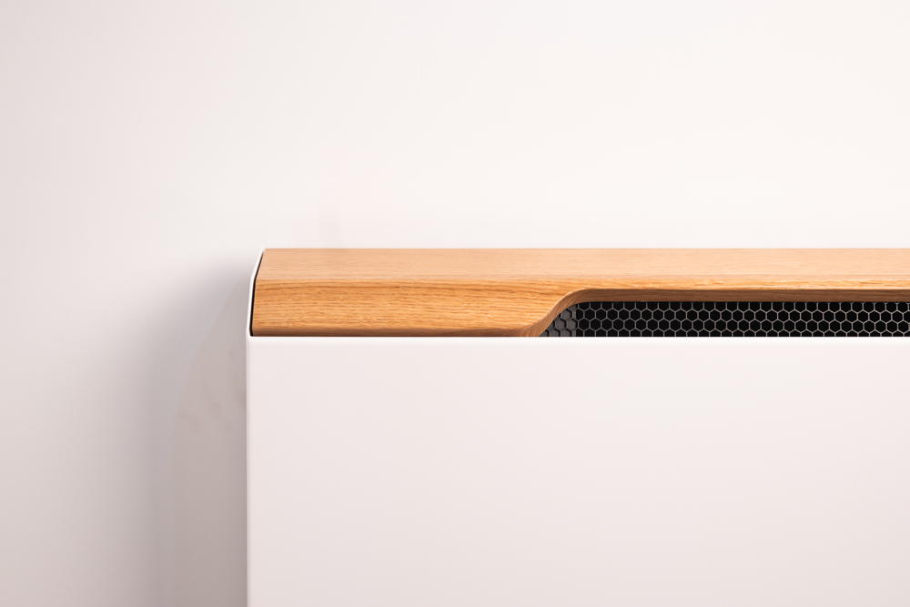
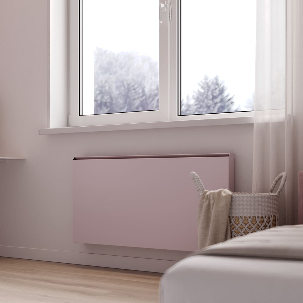
Jaga Net Zero is a range of heat pump radiators for heating and cooling with high efficiency and low CO2 emissions. The sustainable air conditioning units use heat pumps in the most efficient way to reduce CO2 emissions. The compact design with smooth panels, hidden grilles and invisible connections offers a refined and pure look. The Net Zero line is available in various designs and sizes.
'Jaga Net Zero Climate radiators are multifunctional and designed to be placed almost anywhere. They lower the threshold for converting to new eco-friendly climate installations for virtually any building, regardless of architecture, style or technical constraints. They can do their bit to make as many buildings as possible energy-neutral.' — Ivo Nysten, senior and climate designer Jaga
6. Graphics
Musée de la Mémoire ‘PROPRIÉTÉ UNIVERSELLE’®
Designer: Joëlle Tuerlinckx and Adriaan Van Leuven
Client: Joëlle Tuerlinckx, Captures éditions and HOPPER&FUCHS
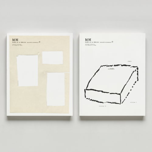
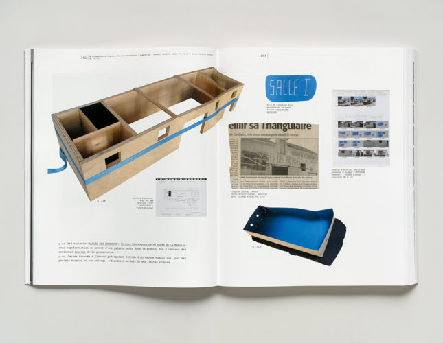
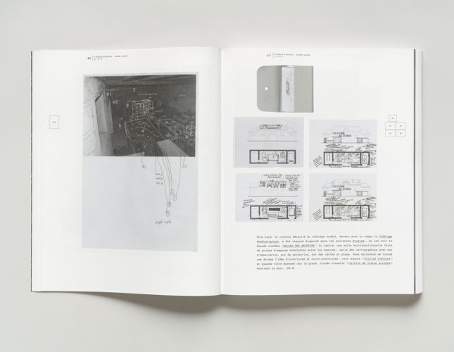
Musée de la Mémoire ‘PROPRIÉTÉ UNIVERSELLE’® is an artist's book by Joëlle Tuerlinckx, which tells, confirms and completes the story of the M.M., a museum without walls. The book was conceived by the artist and developed in dialogue with the graphic designer. The ‘catalogue-inventory of a museum-by-itself’ tells the evolution of a museum as a monument to a former mining area. Without walls, the museum places memory in the air, stretching out into the universal. The book has all the hallmarks of a classic art catalogue: a generous format, with works presented frontally, detached from their context, printed in colour on coated paper.
'Like a journey through the archives of a studio, this book forms a narrative. An inventory of a collection, it could be called a museum catalogue. It could also serve as a guide to the work whose history is told here.' — Joëlle Tuerlinckx, artist
Safer Streets
Design agency: Mutant
Client: L’Oréal Paris
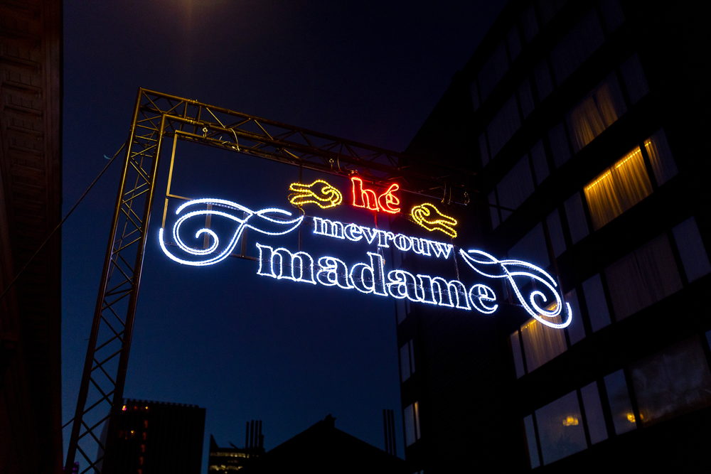
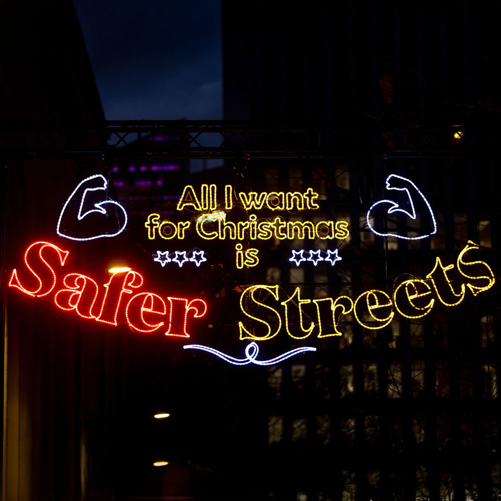
Safer Streets is a light installation in the style of classic Christmas lights that addresses the issue of street harassment against women. It created awareness and fodder for conversation about the problematic situation of street harassment in Brussels and beyond. Statistics were integrated into the designs of the Christmas lights, communicating the seriousness of the problem in a striking and unconventional way.
'We chose to make a statement with an installation in a dark and notorious alley in the capital. We wanted to draw attention not only to the problem of street harassment, which is too often trivialised (95% of women sometimes feel unsafe on the street). The installation also offered part of the solution: by illuminating the dark alley, we improved the sense of safety and created an environment less inviting to street harassment.' — Charlotte Verellen, producer Mutant
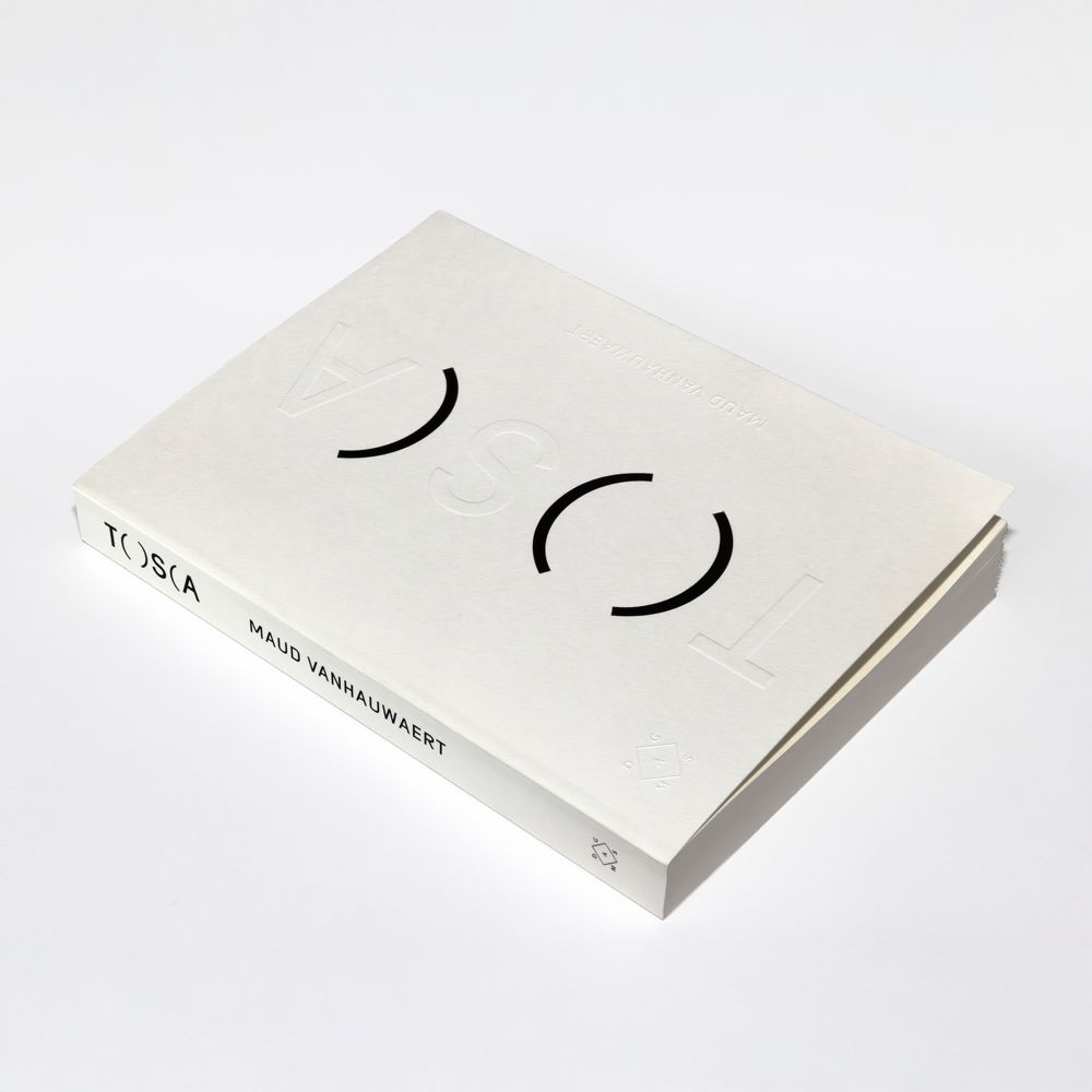
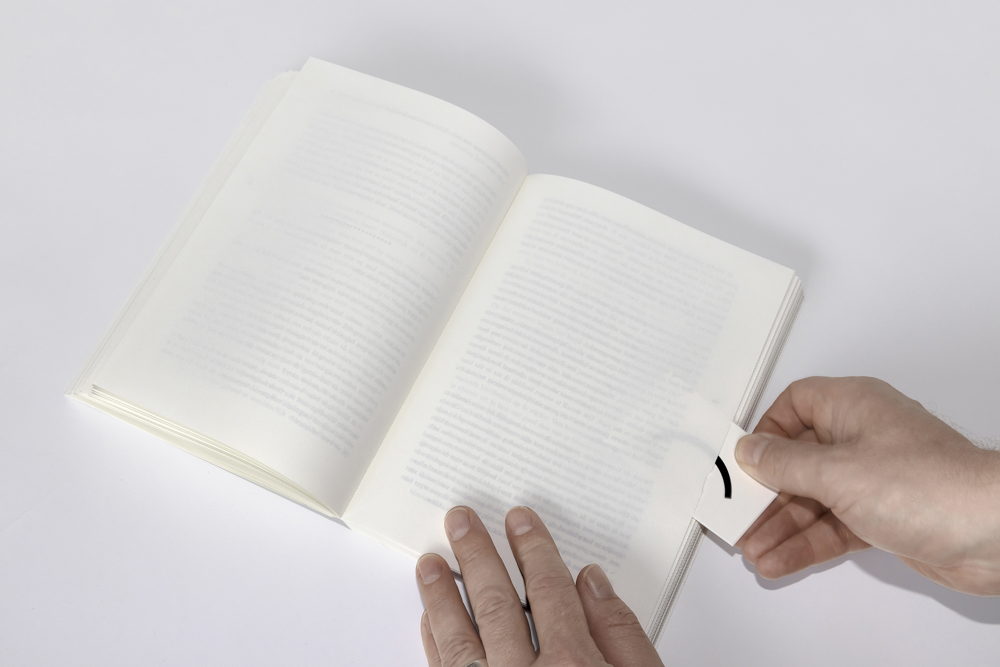
Tosca
Designer: Jelle Jespers
Client: Das Mag and Maud Vanhauwaert
Tosca is a novel hidden inside a collection of poems, masquerading as a blank book. The concept refers to both the novel characters and the poems to be ‘revealed’. The reader has the one-off choice of reading only the poems, but is supposed to unravel the novel hidden underneath. To do so, he has to cut open the closed pages. The typography, the paper chosen and the techniques used fit seamlessly with the story of the book.
'The idea for the physical form arose from the desire to also visually express the underlying feelings of the main character. As the back cover text describes: ‘She is a closed book, better than me no one can understand her.’ We wanted to create a book that initially feels blank, with the reader slowly revealing and discovering the story page by page.' — Jelle Jespers, graphic designer
7. Habitat
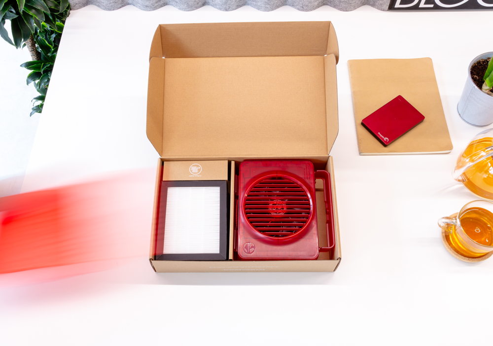
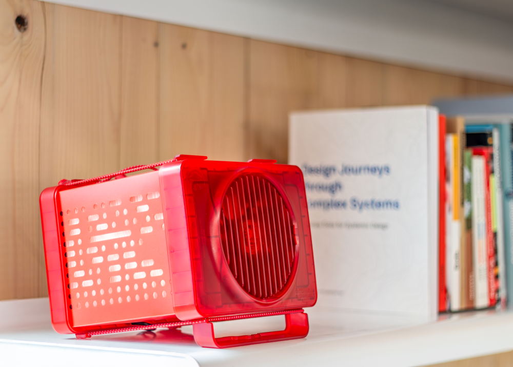
PureAura
Design agency: Dott Achilles (& Albert Ko & Adrian Lo)
Client: Lingnan University
Partner: INNOrigin Limited
PureAura is a simple, low-cost, high-efficiency air purifier designed to improve air quality in small spaces. Its compact and portable design, including a space for the power bank at the back, a handle with an attachment hole and an elastic suspension loop, makes it ideal for use in tight spaces. It is a practical tool that can reduce short-term health risks for residents of subdivided flats in Hong Kong.
'The product is completely flatpack, making it easy to ship. What makes the product extra accessible is that it works on a power bank, something people already have or can easily obtain. Also, no glue joints have been used, so there are no fixed connections. Everything can be easily detached and replaced, making the device ideal for repairs or modifications.' — Pieter Lesage, founder Dott Achilles
Stack
Design agency: studio MOTO
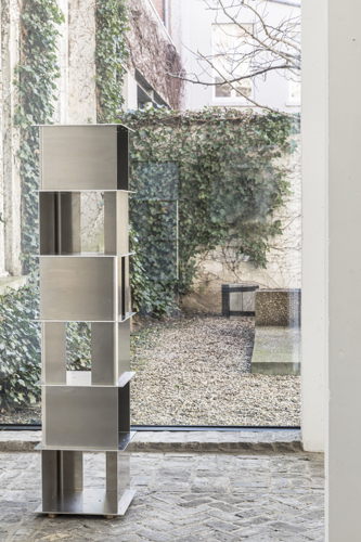
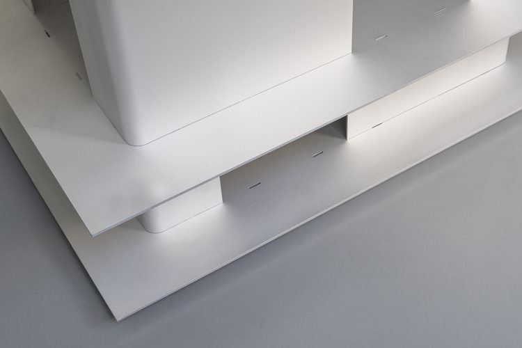
Stack is a modular furniture system consisting of a set of horizontal and vertical aluminium components that click together without screws or fixings and can form different configurations together. The online configurator allows consumers to assemble and order their own Stack. Simple, effective, stable, stackable and expandable. The furniture can later be reassembled, split or supplemented. Moreover, Stack is an entirely Belgian product, designed, produced, packaged and shipped locally.
'We developed Stack out of our own need. We found a beautiful office during the pandemic, but during that period there was so much uncertainty about how long we would be able to stay there. We therefore designed light, easily assembled, dismountable and movable furniture. It also had to be flexible in shape and blend effortlessly into any interior.' — Mo Vandenberghe and Thomas Hick, architects/ designers
Stock
Design agency: Stock Antwerpen
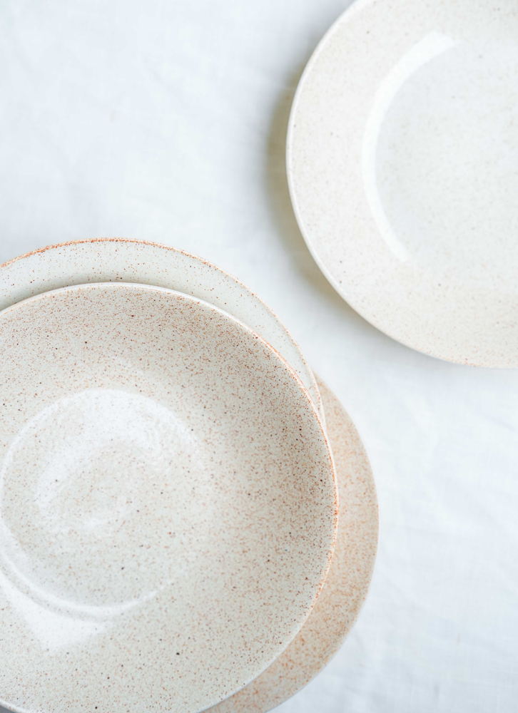
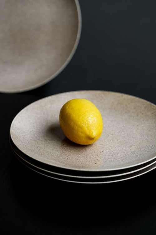
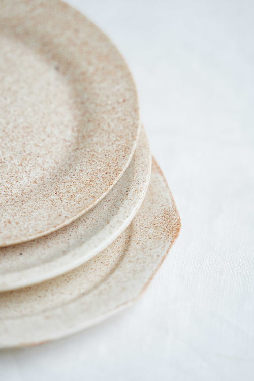
Stock is a circular alternative to tableware, re-glazing existing biscuits. This saves on the raw materials and energy needed to bake a new dinnerware. New, contemporary colour combinations allow plates with different designs to be reassembled into unique sets of tableware.
'Compared to a conventional ceramic production process, we save a lot with Stock Antwerp. 95% of the raw materials we need come from discarded plates. We also reduce energy consumption by about 45% because no biscuit needs to be fired. We also produce everything locally, which also greatly reduces the footprint of transport.' — Sander De Clercq and Charlotte Van Hoecke, designers
8. Spaces
019
Design agency: 019
019 is a transdisciplinary platform that develops in-between spaces for intuitive experimentation, collaboration and encounters between architecture, graphic design and visual art. 019 constantly shows new possibilities and breaks through common ways of exhibiting in artistic and non-artistic spaces. Like a welcoming occupier, 019 invites artists to explore and reveal the potential of these spaces. Subtle, subversive interventions criticise and influence the functioning of public space, challenging established norms and activating the environment from within. From a project space in Ghent, in public spaces and at institutions at home and abroad, 019 thus creates new interfaces between art and society.
'The multiple and collective authorship and ever-changing architecture of 019 keeps the space ever-changing. Allowing different disciplines to work together creates an environment in which new art forms can flourish. Scenography acts as a connecting link, connecting not only artworks but also artists, audiences and casual passers-by. The strength of 019 lies in its ability to produce and present art in a collective way. The project transcends individual art practice and creates space for collaboration and experimentation.' — Artistic team 019
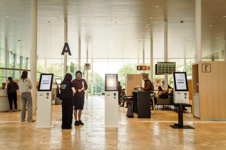
Human-centred design: Ghent municipal offices
Design agency: GELO - Mensgericht Designstudio
Client: City of Ghent
Partners: Superdruk, SAR Architects, Kraaijvanger Architects
The city office is traditionally a public space that attracts a very diverse public. How do you design such a municipal office for a city like Ghent, known for being inclusive with a people-centred mentality? It started from a radically different design approach, in which ‘Human-centred Design’ was at the basis, and became guiding for all executing parties. The result is an extremely people-centred and inclusive city office that can serve as an inspiration for other organisations.
'We see this award as confirmation from the design sector that our vision of designing spaces is shared and widely supported. That we can create a more people-centred infrastructure, and by extension society, by designing from people rather than bricks.' — Raoul Maris, CEO GELO
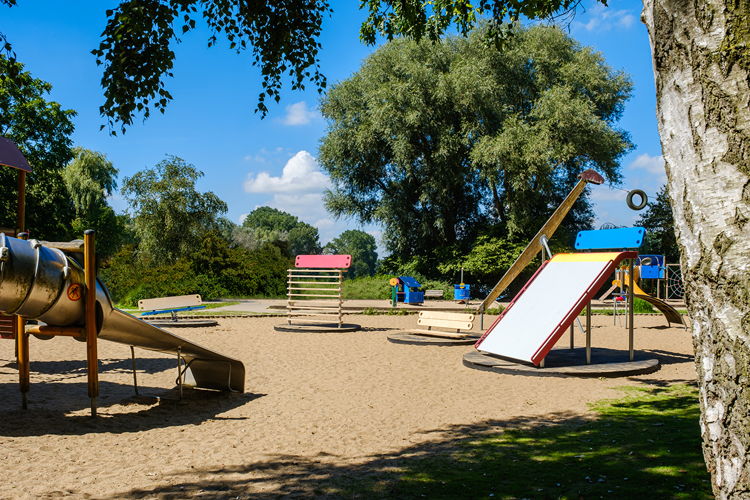
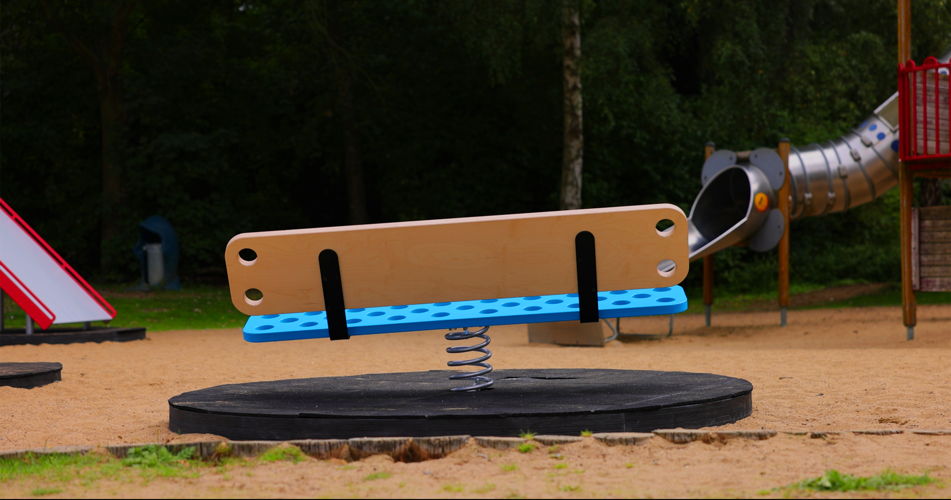
The Adult Playground
Design agency: AKQA Brussels x RAAK Design Studio
Client: Helan independent health insurance fund
The Adult Playground is a series of benches to encourage parents who accompany their children to the playground to exercise. Each bench activates a special muscle group and requires some strength to sit down. The benches were developed in consultation with physiotherapists in response to the question: how can we make people aware of the importance of strength training after the age of 30?
'From the age of 30, we lose 10% muscle mass every decade. It makes 30 a crucial age to start good habits and stop losing muscle mass. However, this is not easy because it is the age when many people also have children and lack time to exercise.' — Creative team AKQA Brussels
For more information or photo material:
check https://henryvandevelde.be/nl/awards/25
follow us on Instagram or Facebook
or contact
Stefan Ceunen
%20Corentin%20Haubruge.jpg)
%20Corentin%20Haubruge.jpg)
%20Corentin%20Haubruge.jpg)
%20Guy-Philippart.png)
%20Guy%20Philippart.jpg)
%20Guy%20Philippart.jpg)
%20Siska%20Vandecasteele.jpg)
%20Siska%20Vandecasteele.jpg)
%20Michiel%20De%20Cleene%201.jpg)
%20Michiel%20De%20Cleene%20Athena%20Clay%20Fair%202.jpg)
%20Hooked%20Visuals%202.jpg)
%20Hooked%20Visuals%201.jpg)
