The Henry van de Velde Awards 24: meet the first winners
Celebrating its 30th edition, the Henry van de Velde Awards proudly unveils the inaugural winners of this milestone year. The jury has selected 3 winners in each of the 9 categories, giving this edition a special place in the rich history of Belgium's most prestigious design awards.
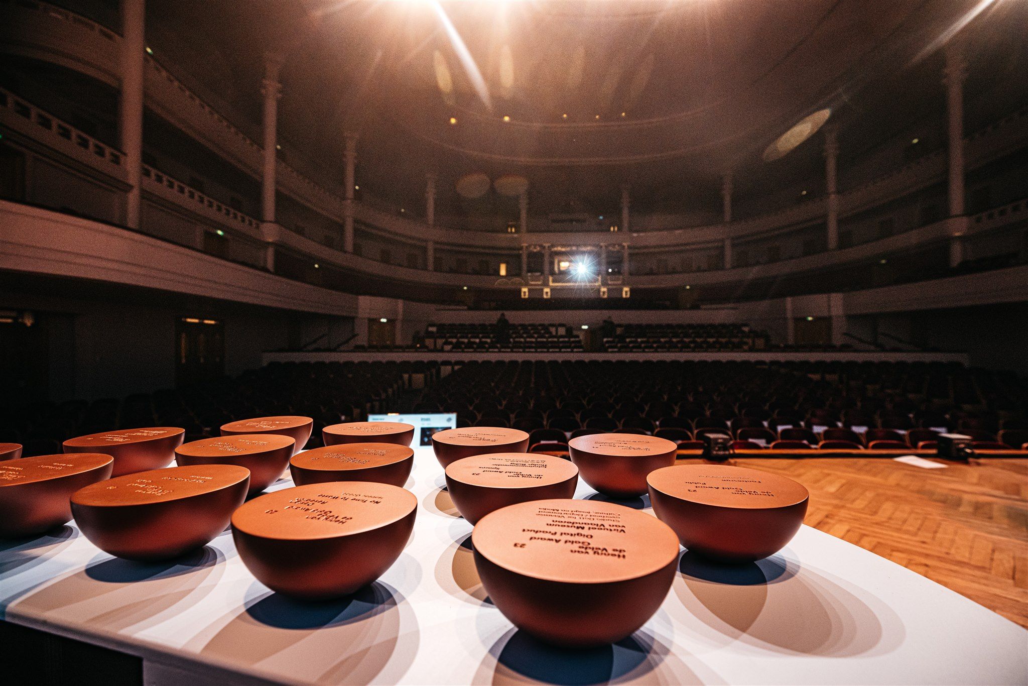
For 30 years, the Henry van de Velde Awards have recognized products, projects, services, and systems from designers and companies in Flanders. These accolades are bestowed upon creations that, through thoughtful design, have a positive and remarkable impact on our economy, environment, and society. Annually presented by Flanders DC, these esteemed design prizes maintain their status as Belgium's foremost design distinctions. In this 30th edition, the chosen winners exemplify the ongoing pursuit of innovation in the world of design.
The jury evaluated hundreds of submissions, narrowing it down to 3 winners per category: Business Innovation, Consumer, Crafts, Design Research, Digital Product, Environment, Graphics, Habitat, and Spaces. The list of winners serves as a showcase of innovative and inspiring design from our country.
The festive award ceremony for the Henry van de Velde Awards on January 23, 2024, at Bozar in Brussels, will reveal who will take home the Gold, Silver, and Bronze Awards in each category. Additionally, the winners of the Lifetime Achievement, Young Talent, Company, Ecodesign by OVAM, and Public Gold Awards will be honored at the event.
From November 14, 2023, until midnight on December 15, 2023, everyone has the opportunity to influence the winner of the Public Gold Award. Through henryvandevelde.be — votes can be cast for one of the various design projects. |
These are the Henry van de Velde Awards winners:
1. Business Innovation
CIRCL
Design agency: CIRCL (Groep Vanhout)
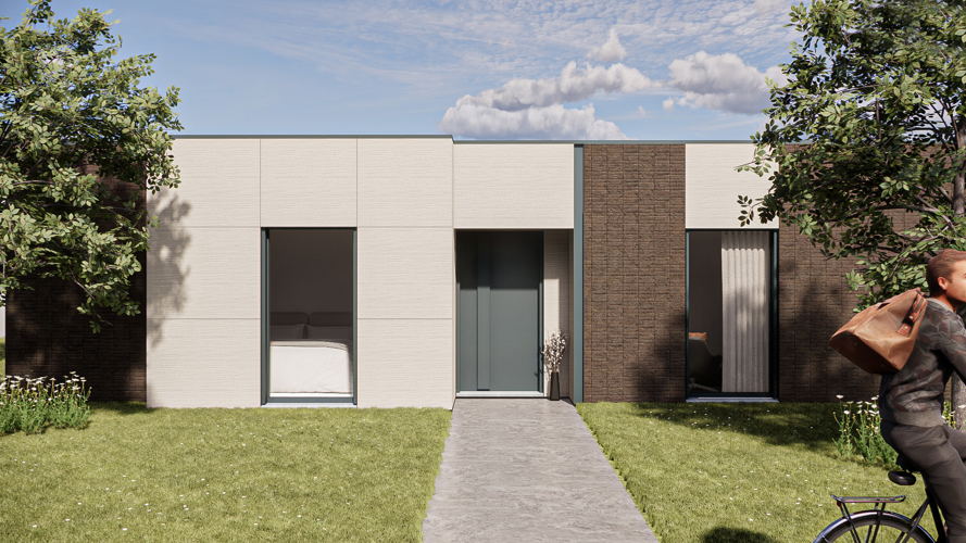
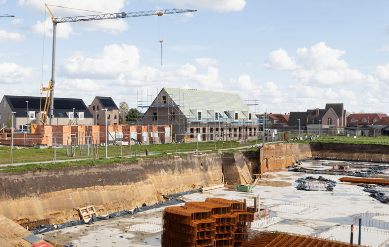
CIRCL, which stands for ‘Creating Innovative Residential Compact Living Spaces’, is a digital housing concept that realises new-build or renovation projects. The software creates different project variations to present to the customer. It can try out all the possible choices, showing the impact of each choice on the total price. A house can largely be produced industrially, meaning that it’s ready in six weeks. A house is energy-efficient, fully modular and demountable, so that all components can be reused. The house consists of 70% bio-based materials and 40% recycled materials.
'We are particularly proud of the combination of sustainability and digitalization, two elements that are recognized as the major trends for the future in the construction sector.' — Peter Bertels
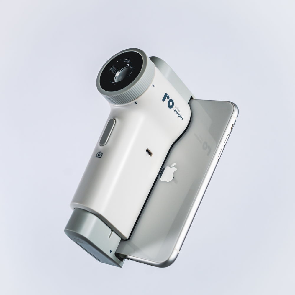
RainsOptics Fundus Link
Design agency: Studio Dott
Client: C-MER RainsOptics
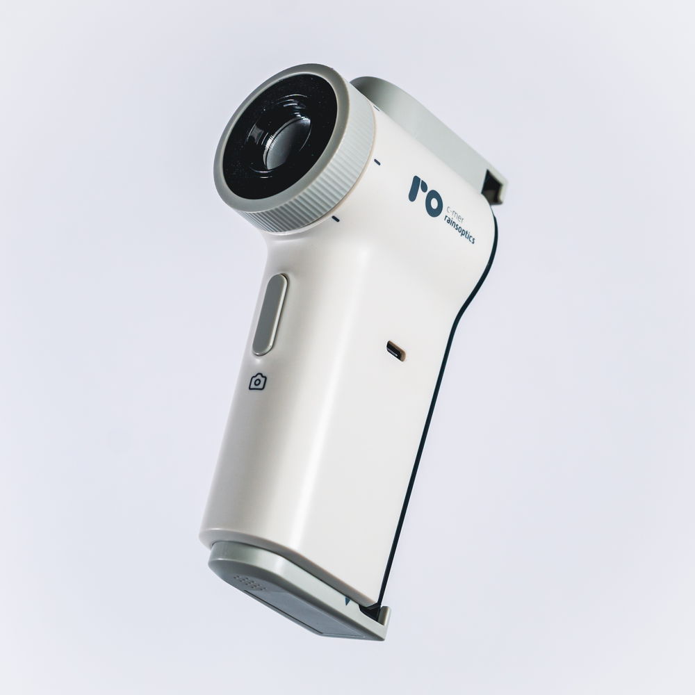
RainsOptics Fundus Link is a medical device that a doctor uses to examine the retina in an accessible, smart, and user-friendly way. Thanks to the use of high-quality camera technology in a smartphone and a set-up of lenses, the threshold for eye examination is lowered and the throughput time is accelerated. The software application allows the images to be easily stored and shared in the patient file.
'Until recently, precise eye examinations were only possible with expensive and cumbersome medical devices. This device is changing that.' — Studio Dott
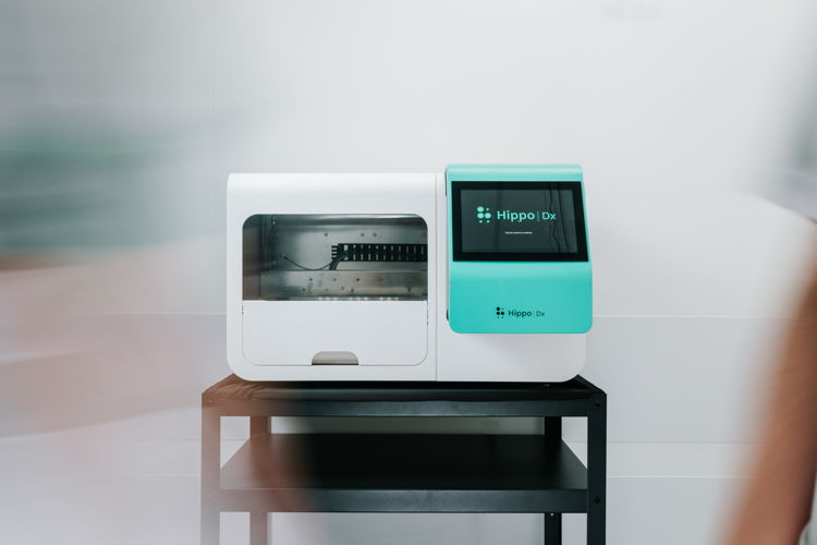
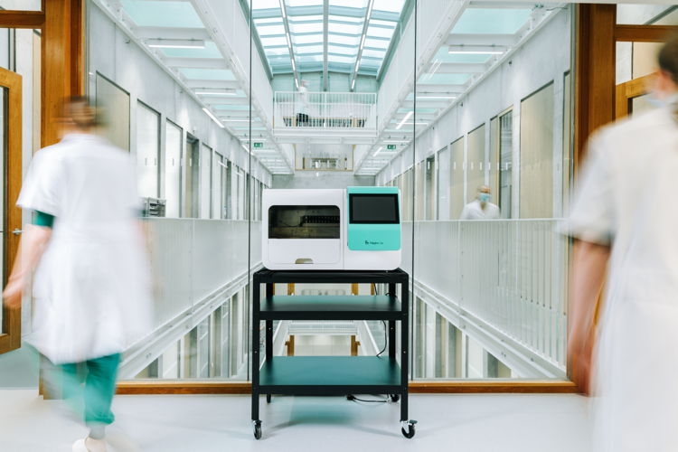
S.P.A.T.
Design agency: Verhaert
Client: Hippo Dx
S.P.A.T. (Skin Prick Automated Test) is a medical device that performs skin prick tests on allergy patients in a faster and more cost-effective way. The touchscreen, compact housing and intuitive control of the device make it very user-friendly and efficient for both the doctor and the patient. Automating skin prick tests ensures more consistent, accurate and digital test results and also reduces the time it takes for medical staff to administer.
'The manual skin prick allergy test has not evolved since the 1960s. There was a strong need for automation, standardization, and digitization.' — Verhaert & Hippo Dx
2. Consumer
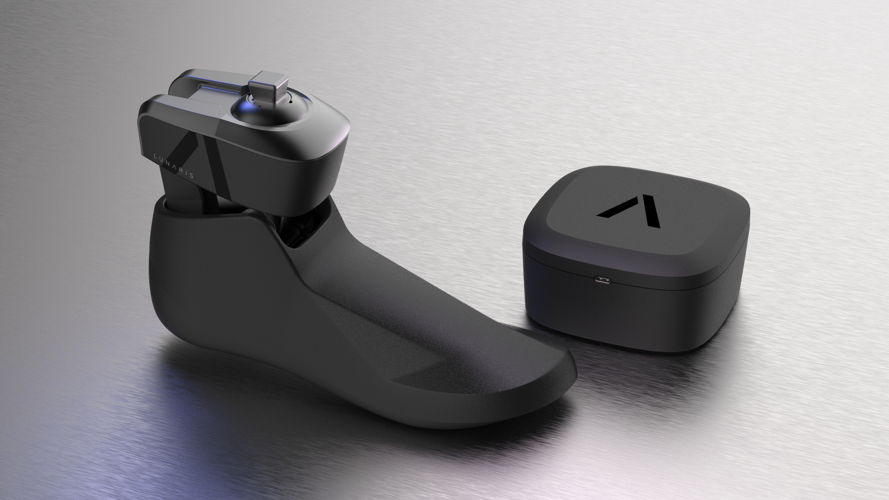
Axiles Bionics Lunaris
Design agency: Achilles Design
Client: Axiles Bionics
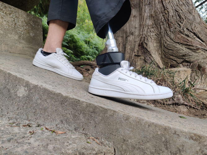
Axiles Bionics Lunaris is an innovative and mechanical solution that mimics precisely the movements of the ankle and foot. This brings comfort and dynamics back into the lives of people with a prosthesis. Even uneven terrain and stairs are no longer obstacles. Inclusivity is also part of the specifications. By moving away from a traditional clinical and orthopaedic appearance, Lunaris aims to make a more human and emotional connection with its users.
'The synergy between engineering and design has been highlighted as a key driver from the very beginning.' — Achilles Design
Loop Earplugs Engage
Design agency: Loop Earplugs
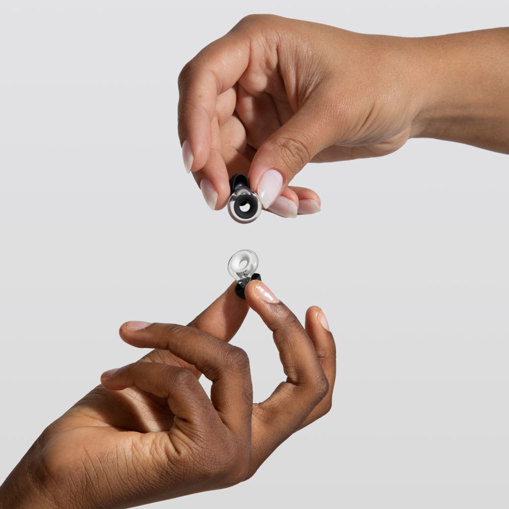
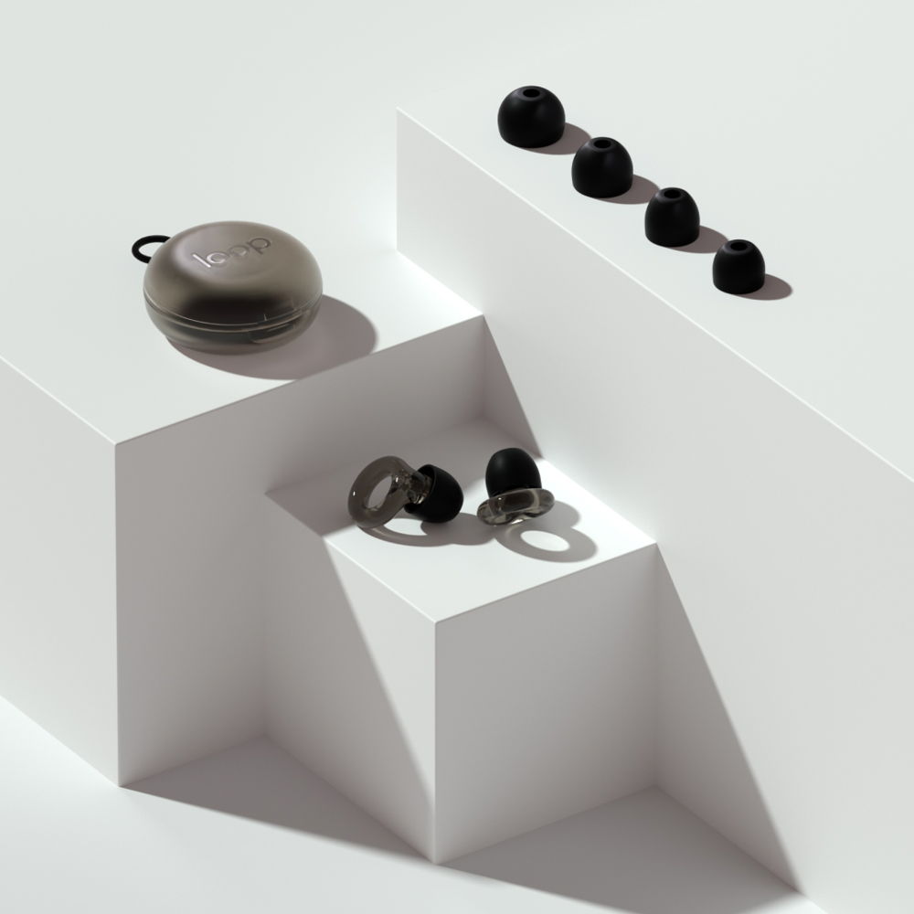
Loop Engage is the third product family of Loop Earplugs’ reusable hearing protection: earplugs for people suffering from noise oversensitivity, which can affect their mental health. Engage is designed for conversation and counteracts the occlusion effect: the sound of your own voice reverberating in your head. By combining an acoustic channel and a filter, the earplugs reduce the volume of noise without distorting it. The stylish, interchangeable earbuds are available in various sizes.
'It was our community that pointed out another application, prompting the need for a customized product. This is how Engage came to be.' — Loop Earplugs
Robi
Designer: Achilles Design
Client: Robinetto
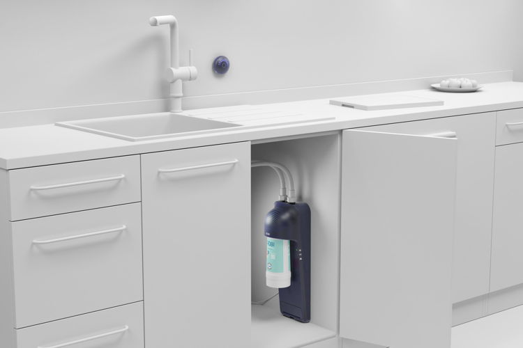
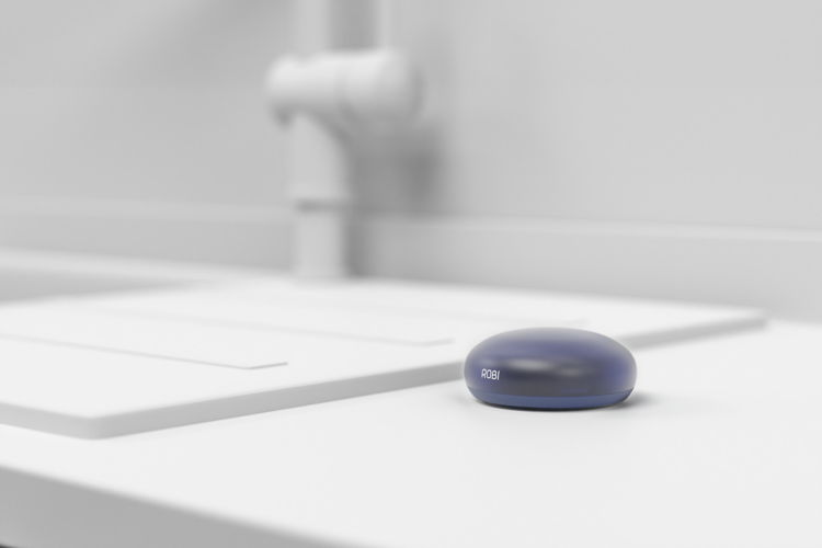
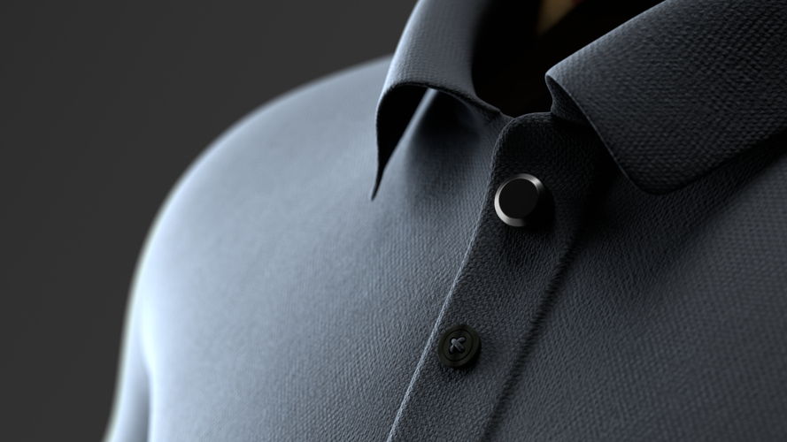
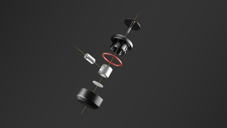
Robi is a modular under-the-sink solution that filters tap water. It enriches the tap water through a choice of capsules that approach the taste of bottled water. Robi is an ecosystem consisting of a module that fits under the sink, the Robi Box, the carrier of the Robi Capsule, and is operated remotely using the Robi Button. The Robi App monitors usage. The aim of Robi is to impact consumer behaviour and prevent the purchase of bottled water. The appliance is low threshold for installation and use.
'During one of our brainstorming sessions, we conceived the idea that dispensing drinking water should be a recognizable ritual, distinct from simply turning on the tap, such as for washing hands. That's how we came up with the concept of using a simple button. 'The water from the button' was born!' — Robinetto
3. Crafts
<Elegy>
Designer: Kexin Zhang
<Elegy> aims to question the distorted values of life within anthropocentrism, more specifically the human exploitation of animals. Humans attach different values to animals, based on all kinds of subjective reasons. Pets are precious and cute, while rats on the street are disgusting and worthless. People take useful parts of animals and throw away the useless parts. Kexin Zhang collected remains of animals and transformed them to express mourning and respect.
'I transformed objects that people consider useless or repulsive into a sense of preciousness and sorrow to express my grief and respect.' — Kexin Zhang
Robotische serendipiteit
Designer: Lie Bormans, DMOA architecten en Research[x]Design, Dep. Architectuur, KU Leuven
Partners: Ruwbouwaannemers: Filip Wiebouw, Danny Kerkhove en RAM, Dep.
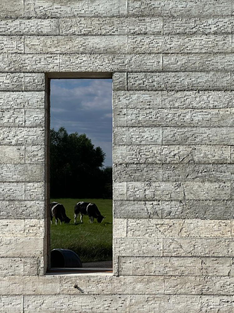
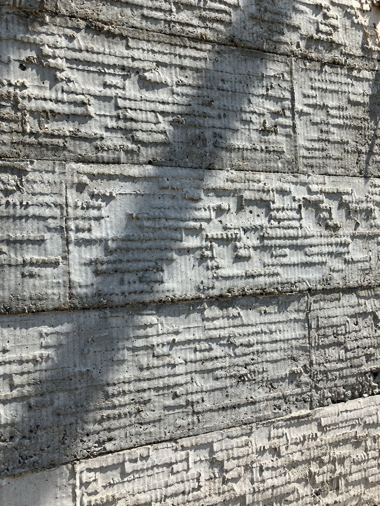
Robotic serendipity enables architects to determine the appearance of concrete surfaces themselves using unique and custom cardboard panels. Robotics makes it possible to treat large surfaces. The material adds an unpredictable dimension as it reacts in a unique way to the robotic operations. The treatment and performance of the material are transformed, with creativity and innovation, into intriguing, characterful textures with a strong artisanal outlook, on the scale of a complete façade.
'The result is a harmony between human expression, robotic precision, and the unpredictability of the material.' — Lie Bormans
Tucumã
Design agency: Atelier Balancê
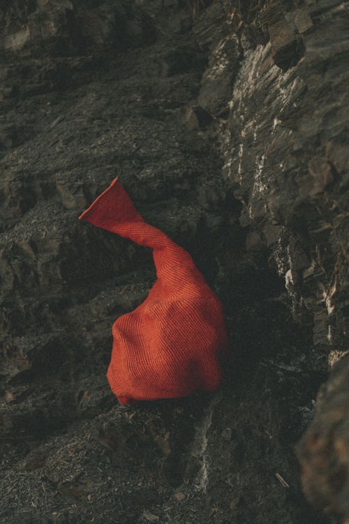
Tucumã consists of woven sculptures made from discarded ropes from a vineyard. The sculptures are a translation of traditional basket weaving techniques into a new design language. ‘Tucumã’ refers to a community in the Brazilian rainforest and more specifically to the Tucumã palm tree and its oily, orange fruit. Ysaline Ophoff applied the techniques learned to waste materials with different characteristics and looked for ways to manipulate traditional forms.
'Applying traditional basket weaving techniques to residual streams slows down the manufacturing process once again.' — Ysaline Ophoff
4. Design Research
Atlas of Lost Finds
Design agency: Unfold
Partners: Alexandre Humbert en Collectief Atlas of Lost Finds
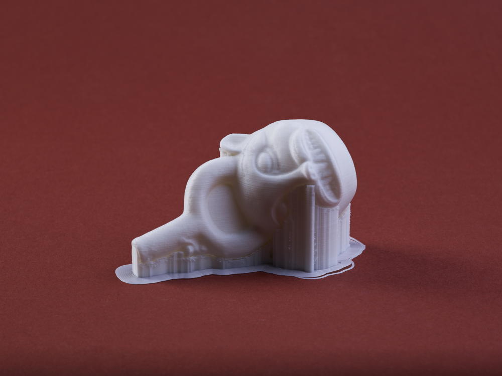
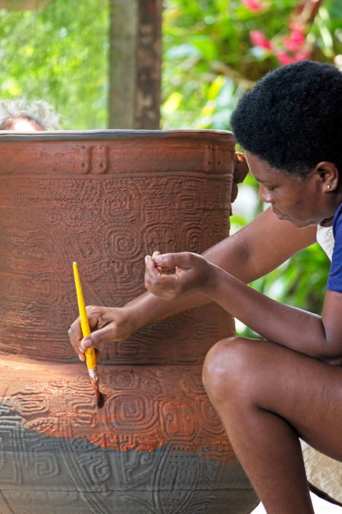
Atlas of Lost Finds is a research project that emerged following the devastating fire at the Brazilian National Museum, which reduced 18 million artefacts to ash. 3D scans produced before the fire are now one of the few remaining traces, surviving as digital ‘ghosts’. The project brings together researchers and makers to breathe new life into lost artefacts and give them a contemporary significance. In a 2020 case study, the project focused on a Peruvian Chimu container. Inspired by the digital 3D model, 30 artists and creators created new objects from contemporary perspectives. A case study in 2022 focused on pre-Columbian ceramics from the Marajó region of Brazil. A multidisciplinary team worked together on-site to create large funeral urns by combining 3D printing in clay and traditional craftsmanship.
'The project aims for a holistic approach to cultural preservation that is not focused on the individual artifact but on the stories and values it represents.' — Unfold
De Droge Delta
Design agency: CLUSTER landschap en stedenbouw, LAMA landscape architects in cooperation with HOGent, Landschap- en stedenbouwbureau Omgeving & Hesselteer, Tractebel & H+N+S landscape architects & IMDC, SWECO Belgium
Client: LABO RUIMTE — Department of Environment and Team Vlaamse Bouwmeester
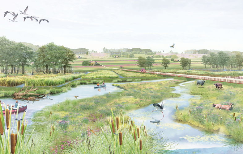
De Droge Delta (The Dry Delta) is an investigation into spatial levers in the fight against water scarcity. Designers, researchers and experts alike shared their insights for this design-based research, which visualises the spatial challenges and solutions to drought in Flanders. The research was set up in a policy context, with a thorough interdisciplinary approach being paramount. This approach was used to explore the problems and causes of drought and to map out the correlation with how we use space. Potential solutions, the desired transformation of the landscape and the space in which we live, were also portrayed.
'With a broad perspective, LABO RUIMTE shifts the debate on water management and drought measures away from an infrastructure-centric approach and addresses drought from a spatial-societal standpoint.' — LABO RUIMTE
Nanto
Designer: Casper Van Herzele
Nanto investigates the implementation of digital product passports in the clothing industry, in response to upcoming European legislative proposals. Although these proposals are being well received, it remains unclear how the policy will be implemented in the industry in practical terms. Nanto explores the preconditions and develops conceptual outlines for solutions that contribute to this challenging future.
'We applied product design methodologies to analyze and visualize legislative proposals. The focal point was translating these into tangible product designs.' — Casper Van Herzele
5. Digital Product
Alcatraz – muziekbeleving in VR
Design agency: A Mad Production
Client: Alcatraz
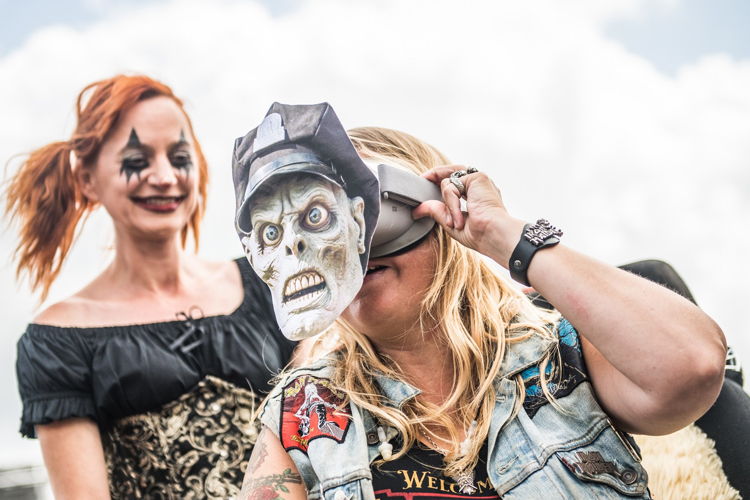
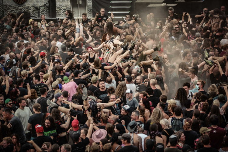
At the Alcatraz Metal Festival, the audience experience in the mosh pit is brought to wheelchair users by means of VR glasses. A cameraman with a 360-degree camera shoots a series of images among the audience in the front stage area, which are then edited immediately. So-called ‘prison guards’ provide the wheelchair users with VR glasses, allowing them to take their place in the crowd for a while, virtually. The experience is incredibly intense, because it's impossible for them to mingle with the audience.
'We employ exclusive technology for a highly inclusive narrative, elevating the experience and engagement of our wheelchair patients to a higher level.' — Bart Gielen (Alcatraz)
KMSKA-app
Design agency: Leap Forward
Client: KMSKA
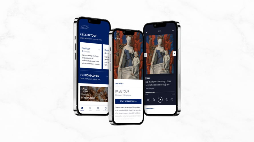
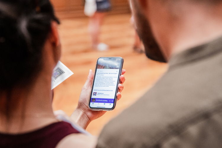
The KMSKA app, which can be used on your own smartphone or tablet or via one of the museum’s devices, provides practical information and explanations about the works of art and shows the route through the museum’s collection. The app is also customisable and has an option for hard-of-hearing or deaf visitors. The sound does not come from the device speaker. Prior to this, an extensive consumer survey was conducted. By mapping the entire process with all touchpoints and all target groups, a product has been created that takes every user into account.
'Throughout the entire process, we succeeded in consistently placing the user at the center and working based on the needs and desires of the museum visitor.' — Marie Denys (Leap Forward)
Shredders’ 540INDY Invitational
Design agency: I-Illusions
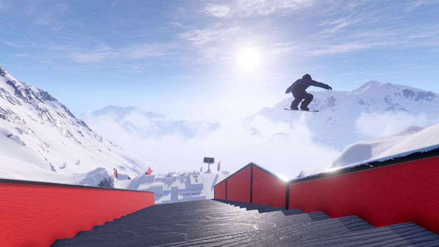
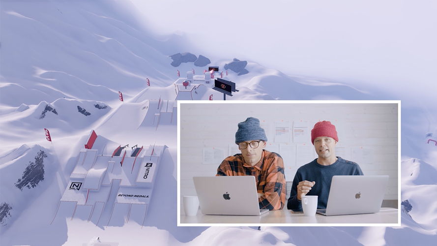
Shredders is a snowboard game, a passion project ‘for riders, by riders’. In the game, leading brands like The North Face, Vans and Volcom are flanked by 540INDY, a fictional brand that allows creators to constantly explore the boundary between reality and fiction. In 2022, they organised Shredders’ 540INDY Invitational, a virtual snowboard competition that builds a bridge between the gaming community and the real world of snowboarding. More than 300 players from 31 countries took part in the qualifiers and the top eight were invited to the final, which was streamed on YouTube. The broadcast contained all the ingredients of well-known formats, including professional commentators and judges, and united thousands of gamers, snowboarders and fans.
'Exploring boundaries, especially out of curiosity, and being rewarded for it feels like receiving a prize for the joy of play.' — Joachim Wemel (I-Illusions)
6. Environment
Archie
Design agency: Wisemen
Client: Co-Laden
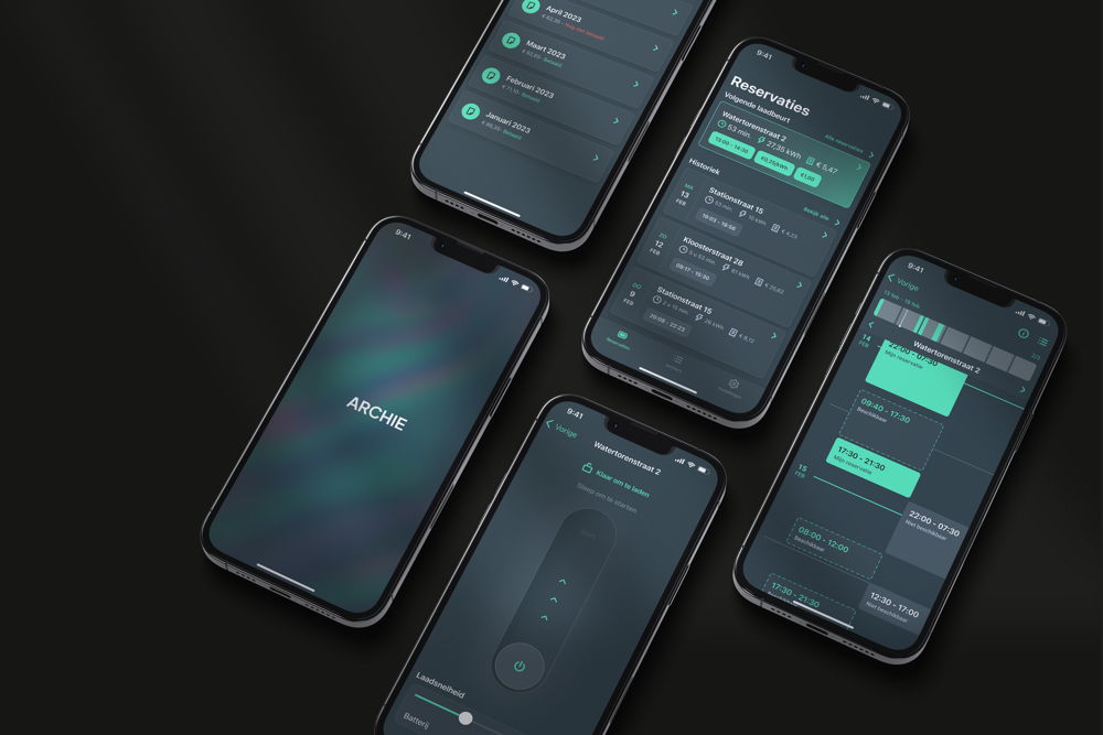
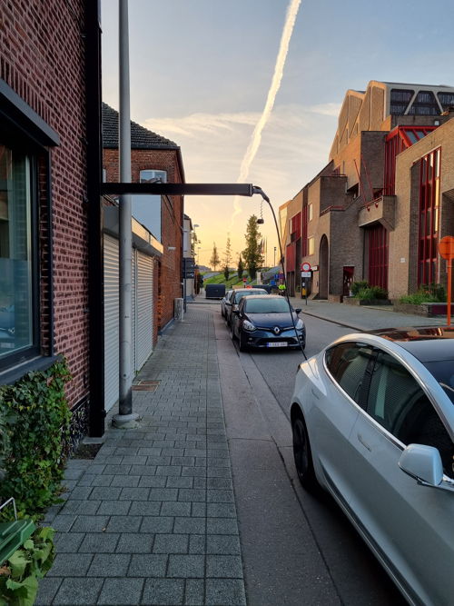
In the pursuit of more sustainable mobility, Archie offers a charging station solution for target groups in cities and terraced houses, who are often forgotten. The Archie charging station is connected to a low-threshold and user-friendly application. In addition to scheduling and monitoring your charging sessions, the app also contains a reservation system so that you can share your charging station with your neighbourhood. The charging station is designed to blend into the facade of your home and neatly bridge the footpath while charging. After charging, you simply fold the charger back in so that it doesn’t cause an obstacle.
'It was incredibly interesting and challenging to address frustrations within charging apps that still frequently occur for users.' — Wisemen
Fairbuds XL
Design agency: Studio Dott
Client: Fairphone
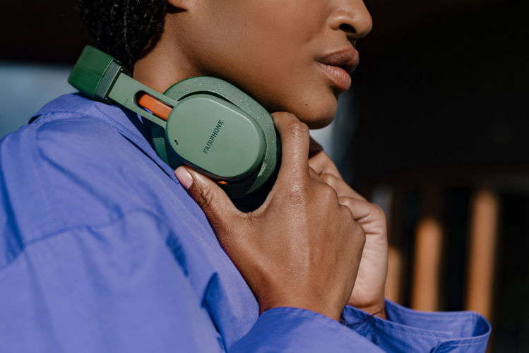
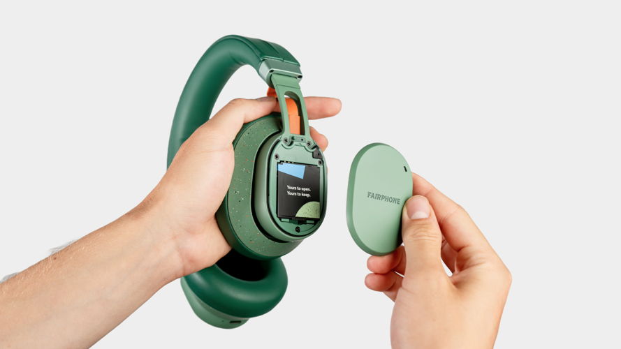
Fairbuds XL are modular noise-cancelling headphones designed to last a lifetime. The user can easily replace all of the parts if necessary, from the headband and pads to the audio components. The device has physical buttons for intuitive operation and folds down for compact storage. The Fairbuds XL are fairly produced with recycled materials and are now also e-waste neutral.
'Within the electronics industry, the issue of e-waste is increasing annually. This headphone serves as a high-quality and sustainable alternative in the audio market.' — Studio Dott
nADA
Design agency: ACE Packaging
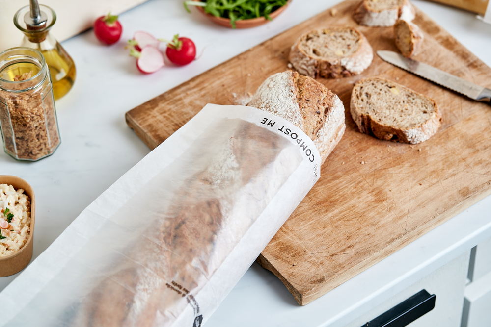
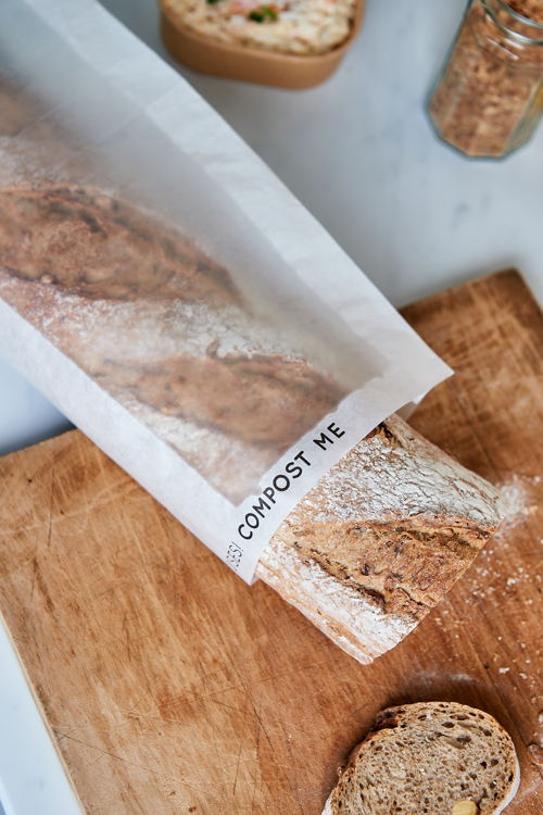
nADA is the first 100% paper bag with integrated window zone that can be recycled. Because the entire bag consists of one material, the end user can no longer make recycling mistakes. The number of adhesive strips has also been halved. A special production process makes the area transparent, which means that the product inside is visible through the packaging. The shape and size of the window can be freely determined by the customer.
'The transparency in the paper creates a significant ecological impact. Moreover, it is cheaper and simpler to produce than the window bag with a plastic window.' — Dave Stappaerts (ACE Packaging)
7. Graphics
Collages & assemblages
Designer: Adriaan Van Leuven
Client: Verbeke Foundation
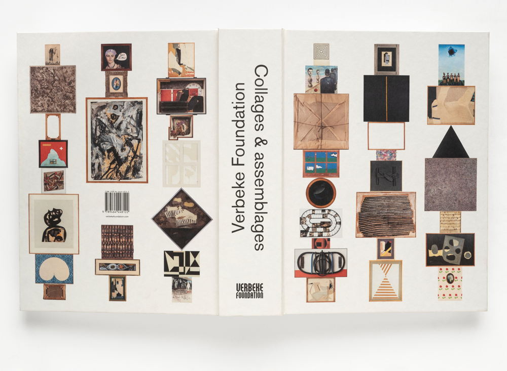
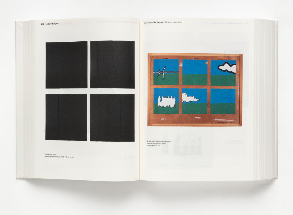
The book Collages & assemblages was published to coincide with the fifteenth anniversary of the Verbeke Foundation. Part of the special collection owned by art collectors Geert Verbeke and Carla Lens, which now consists of more than 6,000 works, is featured across 1,008 pages. The book is designed as a long and uninterrupted stream of images. Without headings or separations, the work of one artist flows smoothly into that of the next. The aim is to bring the collages together as a whole and present the collection as a work in itself. The book is 6 centimetres thick, the maximum that can be finished in an industrial process.
'During a chance encounter with Geert Verbeke, I was given a tour of the depot. I was impressed by the quantity and variety of artworks.' — Adriaan Van Leuven
Custom typefaces
Designer: Erik Desombere
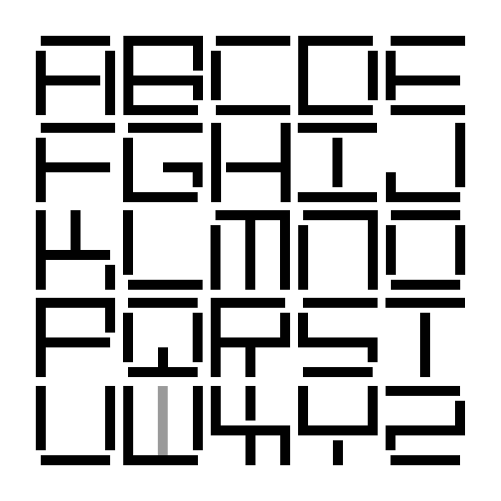
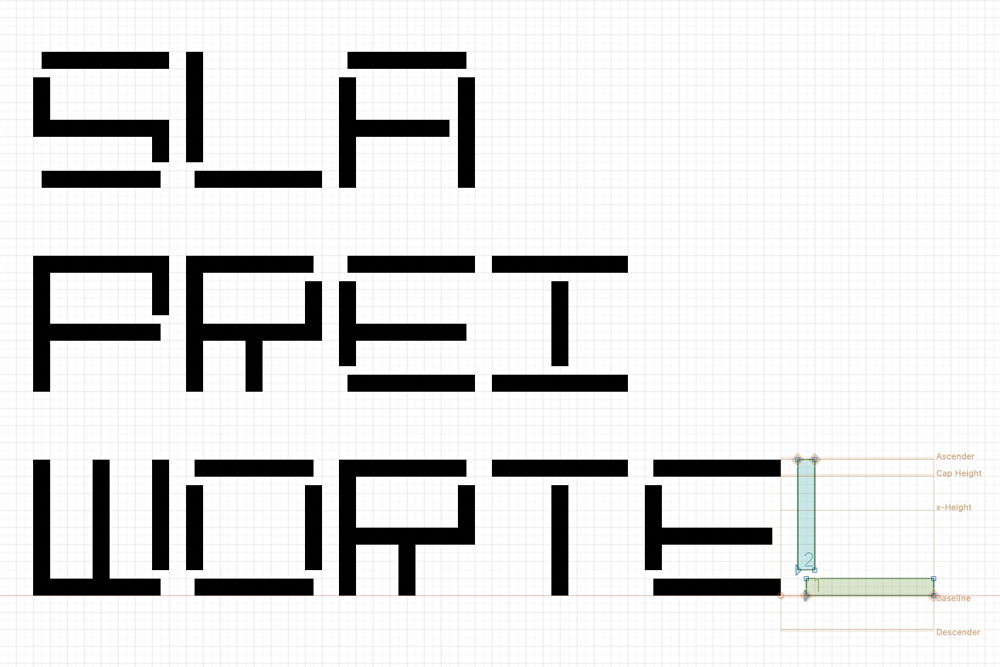
Erik Desombere developed three fonts, in which mathematics and systematics play an important role. He designed a typographic logo for Greenconcepts within a grid of two squares wide and four high. This led to the development of a font with different height variants, with the letters being able to be used interchangeably. The second font grew out of the design for the new logo for Sint Lucas Antwerp, with the building’s facing brick joint as a formal starting point. Referencing a hand-drawn 1987 logo design for Industrimmo, he created a third font with a solid grid of five by seven squares, criss-crossed with every possible diagonal.
'What captivates me the most is the design process: the construction, refinement and improvement. The exploration of new typographic possibilities never ceases to surprise.' — Erik Desombere
Waters
Designer: Tim Bisschop
Client: Hannibal Books
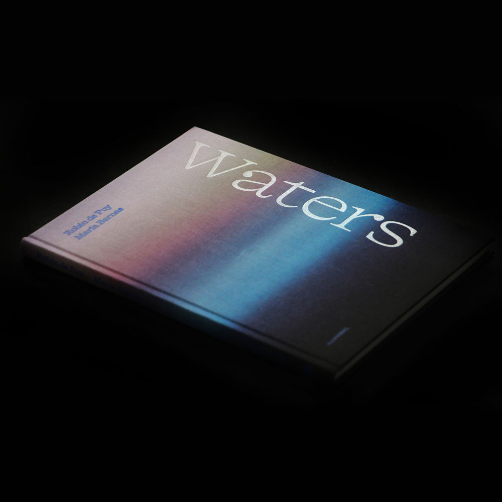
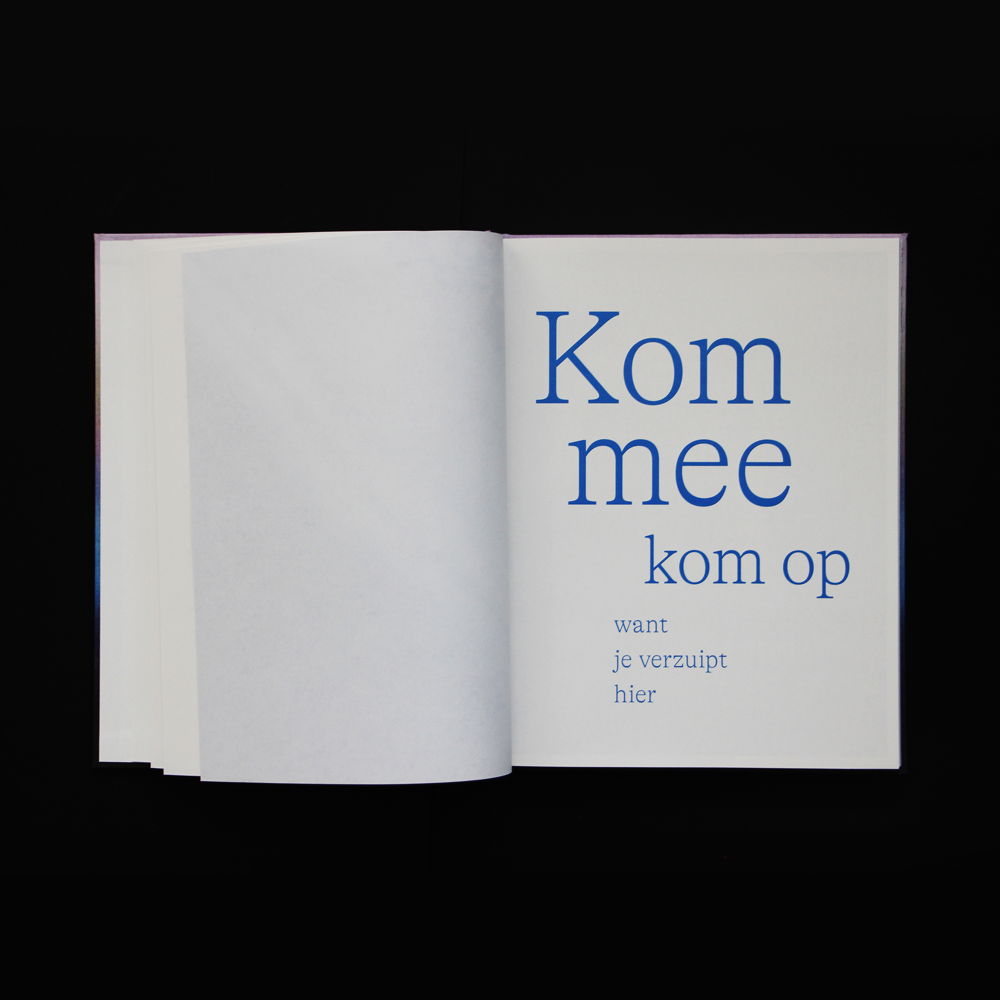
The book Waters commemorates the flood disaster of 1953 in the Netherlands through memorable photographs by Robin de Puy and poetic snippets of text by Maria Barnas. The cover, wrapped in a linen fabric with an abstract colour gradient, shows the threat of rising water. The title, printed in transparent foil, is recessed into the image and is only visible if you hold the book against the light, like the reflection on the surface of water. The interior is printed on soft, uncoated paper, nicely matching the warmth and humanity of the stories. The aerial images are displayed on a thinner, almost translucent matt paper and printed in a monotone blue.
'The design naturally stems from the theme of the book. The form of the book was meant to encapsulate the experiences, memories, and emotions of the individuals portrayed.' — Tim Bisschop
8. Habitat
Brion
Design agency: Axelle Vertommen
Client: Matière Grise
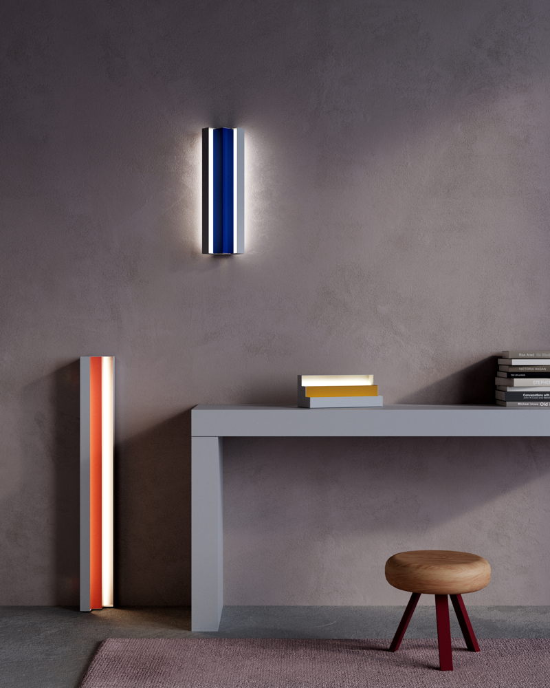
Corners form the basis of a room, but are often neglected. This was the starting point for Brion, a lamp that can be installed in a corner. The lamp consists of two pleated sheet steel structures that fit together. The combination of inner and outer skin hides the LED light source, creating indirect light. The range has been expanded with wall and standing lamps in three heights that can be installed both horizontally and vertically. The lamp is available in 38 colours, for both the inner and outer skin.
'I made the initial sketches during a train journey, inspired by a piece of jewelry from Studio Collect, which in turn drew inspiration from Carlo Scarpa's cemetery design.' — Axelle Vertommen
MyGrid ModuleOne
Designer: Roel Heyninck
Client: MyGrid
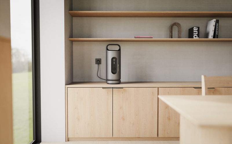
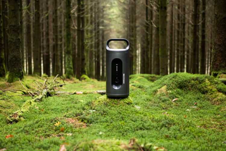
MyGrid ModuleOne™ was developed to meet the demand for a smart, bi-directional home battery that was more accessible for consumers both financially and practically. Thanks to the app, the device is easy to operate as a plug-and-play solution that you can take anywhere, in order to be energy-independent. In addition, you gain a better understanding of your energy consumption and can save costs by storing energy when it’s cheap and using it when the price is high.
'Thanks to this battery, the energy transition is accessible to everyone, not just those with technical know-how or deep pockets.' — Jan Wellens (founder MyGrid)
Poly
Designer: Michaël Kruijne
Client: Drisag
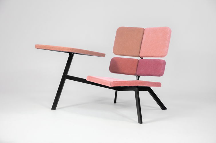
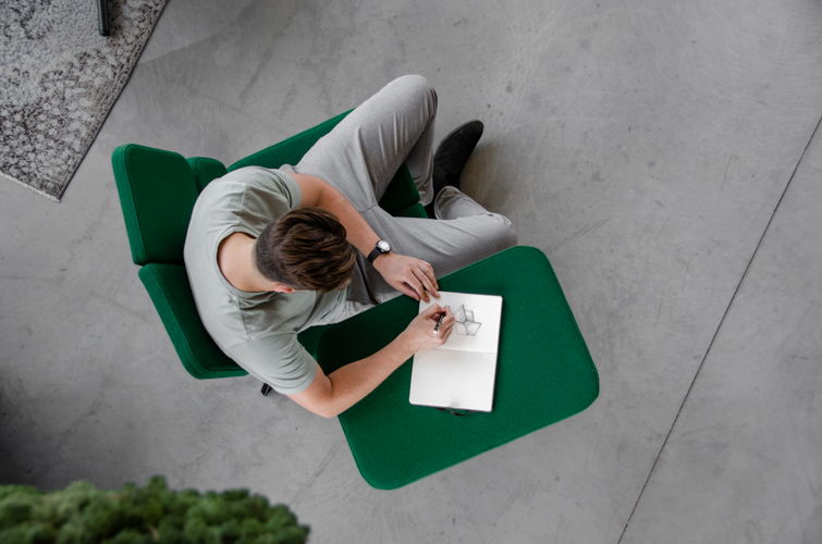
Poly is a low lounge chair with a wide armrest that facilitates the use of a laptop or tablet. The concept works with different facets positioned at an angle to each other, approximating an ergonomic bucket seat. The chair is designed from a circular perspective and has an efficient production process. Drisag produces locally and sells directly from the manufacturer to the customer, which ensures a short chain and accessible aftercare, such as for repair and reuse.
'This project aims to illustrate how a circular mindset can lead to valuable furniture pieces, where multifunctionality results in maximizing utility.' — Michaël Kruijne
9. Spaces
1302
Design agency: CREATE.eu
Partners: Koen Bovée (scenography), Atento (construction)
Client: City of Kortrijk
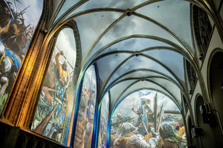
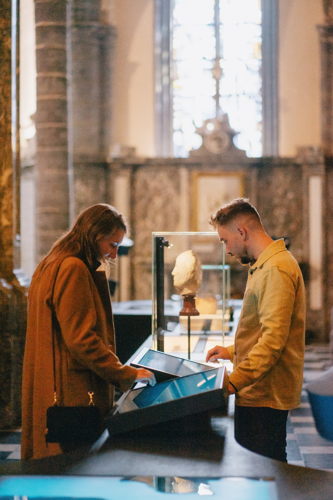
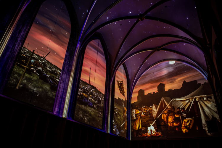
1302 is a multimedia experience exhibition at the Onze-Lieve-Vrouwekerk in Kortrijk that zooms in on the Battle of the Golden Spurs. The church, a historic site that overlooked the battlefield in 1302, bears silent witness to the narrative of the battle. This is why it is the perfect canvas on which to tell the complex history through this exhibition. CREATE.eu opted for a high-tech approach, with digital storytelling playing a central role. Visitors are taken on a journey through an immersive animated film, a multimedia experience table and an identity wall.
'The numerous requirements regarding the preservation of the sacred atmosphere, the conservation of heritage value, and the continued hosting of celebrations in the church made the integration a tour de force.' — Fréderique Malbrancke (CREATE.eu)
Circular construction kit for learning environments
Design agency: PG21
Client: Kamp C (Province of Antwerpen)
Partners: Thomas More Campus Lucas Faydherbe and Vast Architects
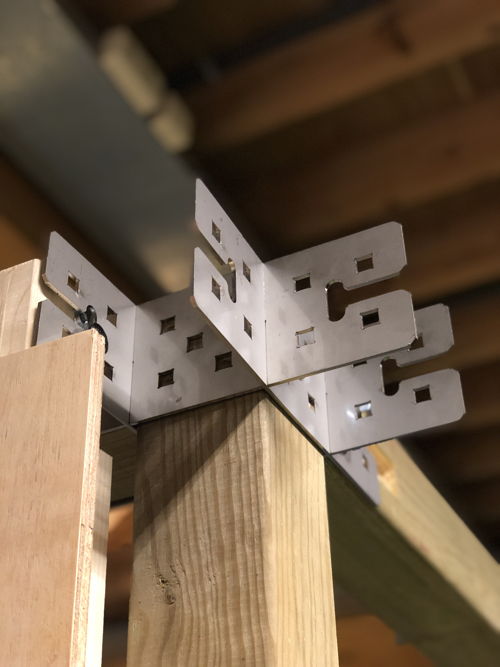
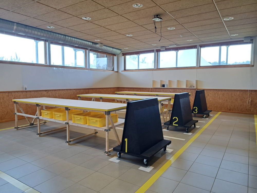
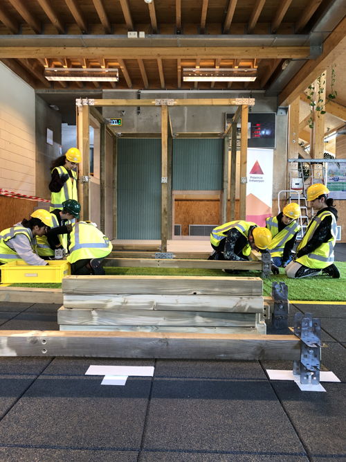
Circular construction kit for learning environments is a real-life simulation and construction kit to encourage young people aged ten to fourteen to build on a circular and bio-based basis. The simulation consists of two physical spaces at Kamp C (a prefab lab and a construction site), a digital construction kit and a circular construction kit with bio-based materials. The students prepare a digital design remotely, before actually realising their project on site. A building system with modular mounting system and unique dimensions has also been created for this purpose.
'As it is crucial for the construction sector to look very different in fifteen years, the simulation provides young people with the opportunity to get acquainted with the future of building right now.' — Stefan Van Ouytsel (PG21)
LL102
Design agency: URA - Yves Malysse and Kiki Verbeeck
Partners: Dejardin bv
Client: City of Ghent, Culture Department
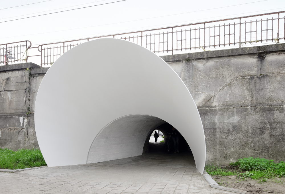
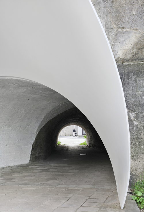
LL102 is an artistic integration into the pedestrian tunnel under the railway in Ledeberg. The view through the tunnel is formed by the atypical movement through the tunnel. The project seeks to intensify this movement by properly accentuating the entrances. By installing a steel structure that engages with the existing perspective, visibility is more clearly defined. The daily use of the tunnel is therefore made more pleasant for local residents.
'The result of a successful intervention in public space is like a well-designed doorknob, similar to a knife that comfortably fits in the hand, or a couch that molds itself to daily use.' — Yves Malysse (URA)
Save the date
On January 23, 2024, the celebratory award show announcing all of the winners of the Henry van de Velde Awards 24 will take place at Bozar in Brussels.
About the Henry van de Velde Awards
The Henry van de Velde Awards, an integral part of the design landscape since 1994, are annually presented by Flanders DC. This year, the awards are made possible through the support of our partners: the Flemish Agency for Innovation and Entrepreneurship (VLAIO), Bozar/Centre for Fine Arts, the Public Waste Agency of Flanders (OVAM), the Flemish Environment Agency (VMM), and Bokrijk.
More information through — https://www.henryvandevelde.be/
For more imagery please contact ikram.annouri@flandersdc.be
Contact
Ikram Annouri
Stefan Ceunen
%20Deceuninck.jpg)
%20CIRCL.png)
%20Nuo%20Chen%204.jpg)
%20Nuo%20Chen%203-1.jpg)
%20Birgit%20Sterckx%202.jpg)
%20Birgit%20Sterckx%205.jpg)
%20Wim%20Knapen.jpg)
%20Michiel%20De%20Cleene%203.jpg)
%20French%20Beans%20Photography%203.jpg)
%20French%20Beans%20Photography%201.jpg)
%20Guy%20Philippart%201.jpg)
%20Guy%20Philippart%204.jpg)
%20Benoit%20Challand%207.jpg)
%20Benoit%20Challand%205.jpg)
%20Daphne%20Matthys%201.jpg)
%20Stad%20Kortrijk%201.jpg)
%20Daphne%20Matthys%2010.jpg)
%20Filip%20Dujardin%201.jpg)
%20Filip%20Dujardin%208.jpg)